I acted as a solo Product designer
Onboarding
Business marketplace
April 2026
1 Project manager, 1 Dev, 1 Product owner
Turning browsers into paying customers for Iceland's leading business marketplace.
A full app redesign for Iceland's leading business marketplace. This study zooms in on one flow: the onboarding that added a paywall and routed buyers and sellers differently.
Context
Kennitalan is a marketplace for buying and selling businesses in Iceland.
When the company approached me, the goal was to automate the sales team's manual work and start earning on subscriptions. And everything had to be done as soon as possible, of course. Onboarding was one of the core flows we started with.
Problem
Before, there was no onboarding, therefore, no personalization, lots of manual work no activation, no conversions.
Before: Sign Up
1
In the previous version, users signed up and landed on a settings page — no guidance, nothing tailored to why they'd come. Every path to value ran through Kennitalan's team: buyers had to be sent an invoice by hand to subscribe before they could see prices, while sellers waited for a callback to finish the listing. Nothing closed without a human in the loop, so only the most motivated users stuck around and few ever paid.
As the sole designer, I was responsible for turning that manual flow into onboarding that could stand on its own, and, activate.
Outcomes & impact
Users actually started converting into customers

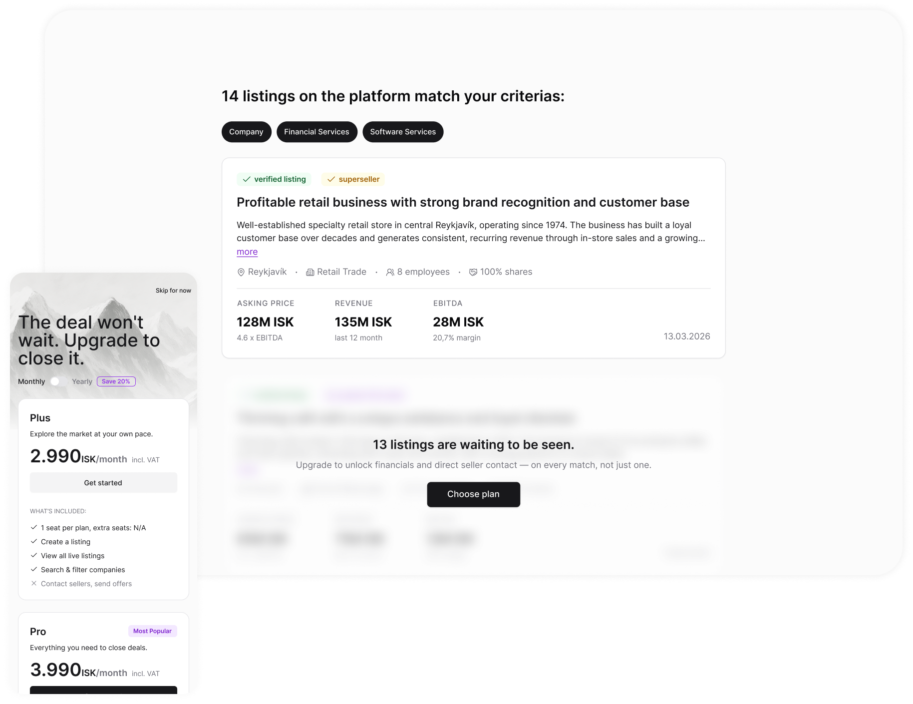
Buyers tell us what they are looking for on the last step of the onboarding so the first listing they see is a real match with a real price. The upgrade banner comes right after — once the value is already on screen.
100% of manual data collection, gone
Onboarding that feeds re-engagement
Research
Buyers, sellers, and brokers walk in with different goals
I received a Word doc from the team of every question they'd been asking users. Since users were clearly coming in with different intents, we knew early on we'd need to fork the experience rather than build one generic flow.
I used AI to sort the questions into a rough lo-fi flow, then identified the information every user needs regardless of intent — that formed the first three mockup screens. I used Claude skills to audit the mockups against UX heuristics and design laws, perfecting them along the way.
From there, I mapped the flow against the three cohorts signing up and their JTBD:
- buyers (when I'm evaluating a company to acquire, I want to see the full listing details, so I can decide whether it's worth pursuing)
- sellers (when I list my company, I want to attract genuine interest from qualified buyers, so I can sell it on good terms)
- brokers, acting as both
Next, I looked at how other marketplaces — Flippa, Acquire, Upwork — solve two related problems: how they fork users by intent, and how they keep a long onboarding flow from losing people.
Takeaway #1
Sellers had to list for free
Charging sellers would have starved the platform of the listings buyers come for and lead to churn on buyers side. So sellers list for free — and that supply is what makes a buyer subscription worth paying for.
Takeaway #2
Every extra question costs completion
The handed-over list had far more questions than onboarding could survive. Each one is a chance to drop off, so we kept only the fields the platform actually acts on and delivers value to the user — matching, verification — and cut the rest. Fewer questions, more people reaching the end.
Exporations
Not every product needs AI — part of the job is knowing when it earns its place.
The client wanted to try an AI-native, chat-led onboarding; I weighed it against what this flow had to get right, in priority order — trust (it asks for a national ID), fit (a 40+ primary audience rewards familiarity over novelty), and completeness (every required field captured cleanly). A guided flow won on all three.
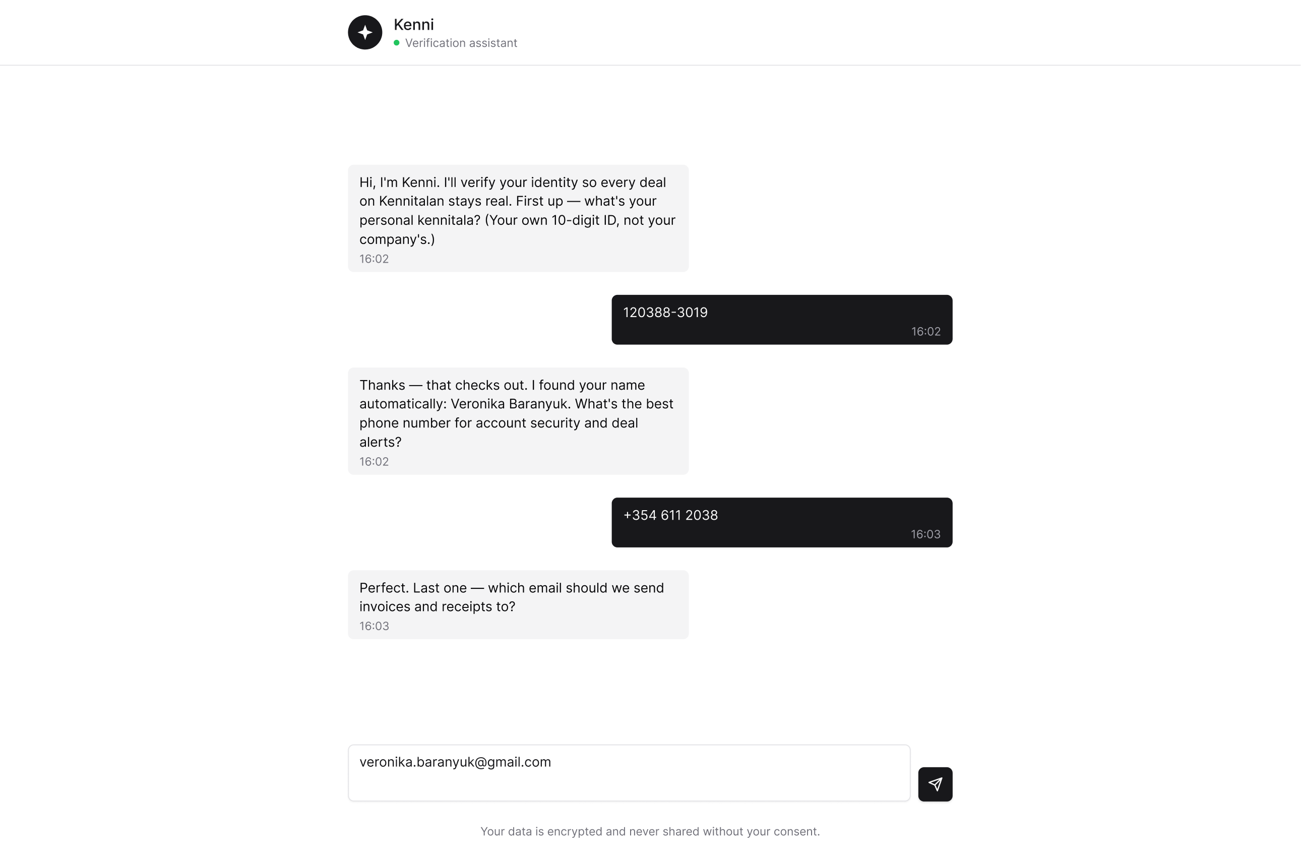
Option A
AI native chat

On-trend: the direction the client was excited by, and modern on the surface.

Wrong for the audience: users skew 40+ and conservative — a chatbot reads as unfamiliar, not welcoming.
Breaks trust at the worst moment: only ~1 in 10 people are comfortable sharing sensitive data, and AI trust runs lowest in finance and personal-data contexts — exactly where a kennitala ask sits (Deloitte 2025; YouGov 2025).
Option B
Progressive, step-by-step (chosen)
Familiar: a considered, form-based flow that matches how this audience expects to give sensitive data.
Controlled path: conditional steps (intent → different later questions) keep everyone on a complete, valid flow.
Engineering cost of the branching: the conditional intent-split (buyer vs. seller paths) is genuinely more to build and maintain than a flat form or a single chat.
Final design
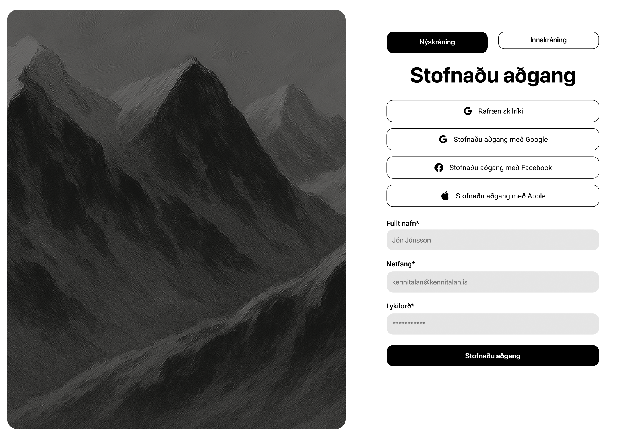
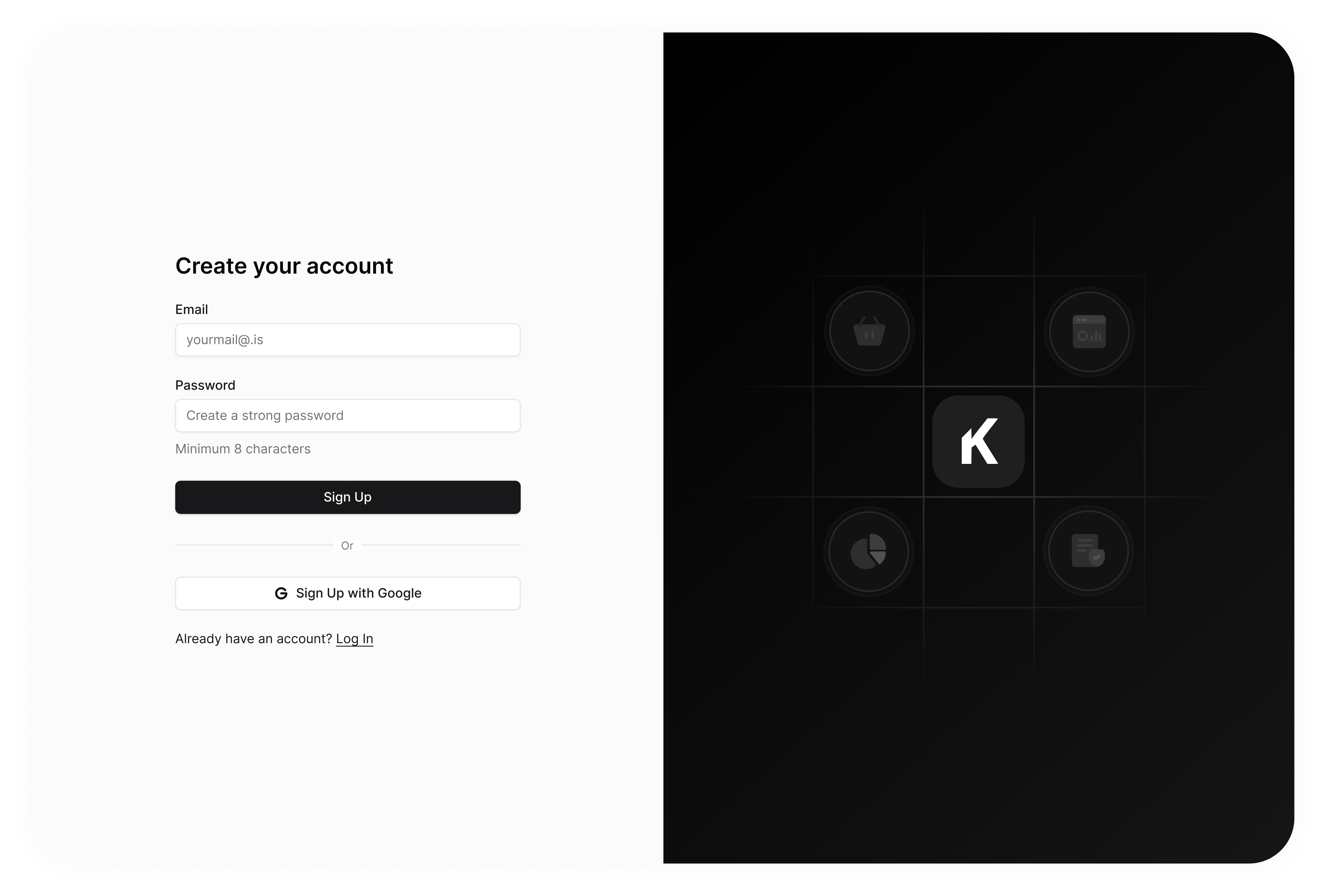
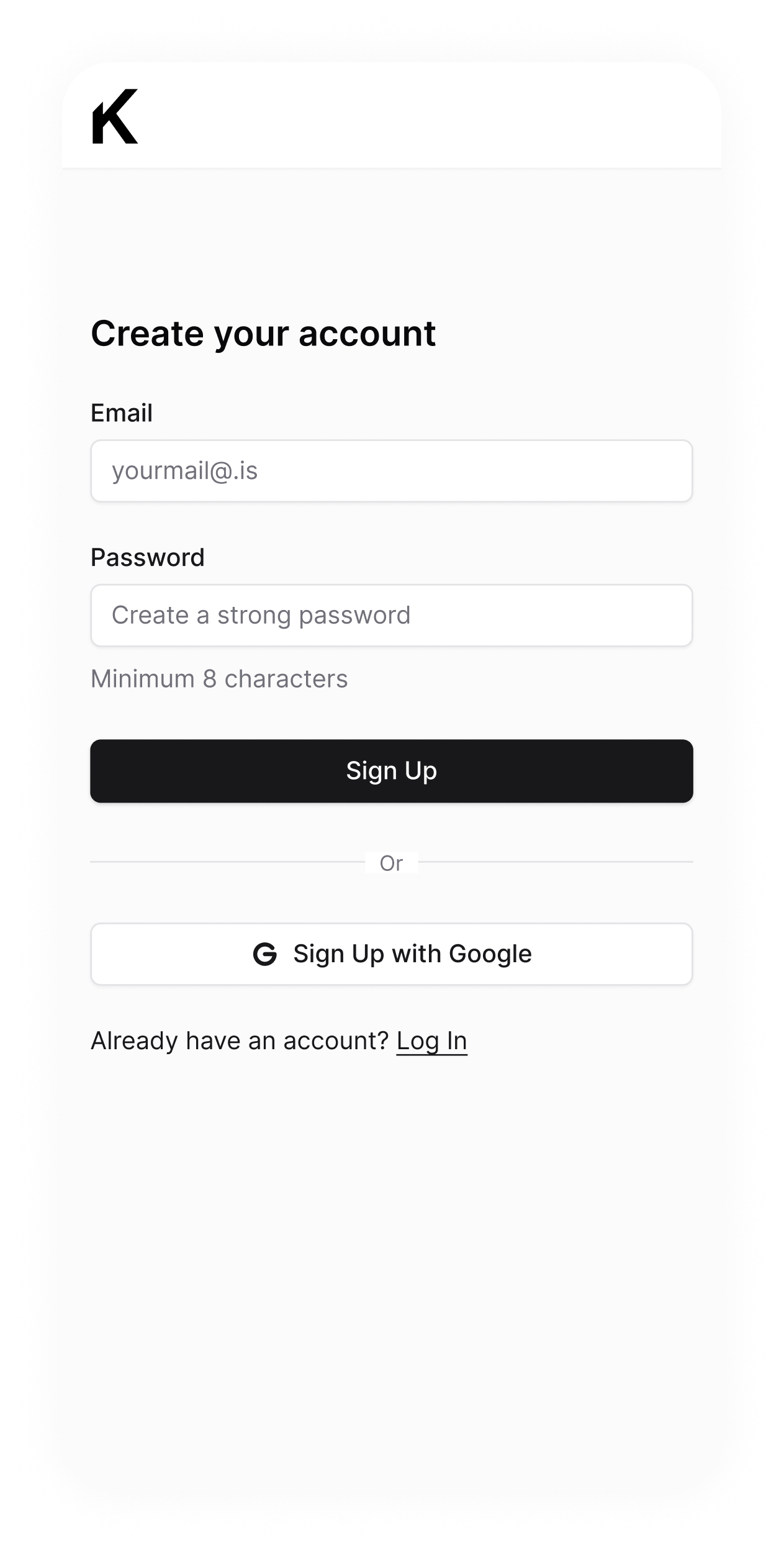
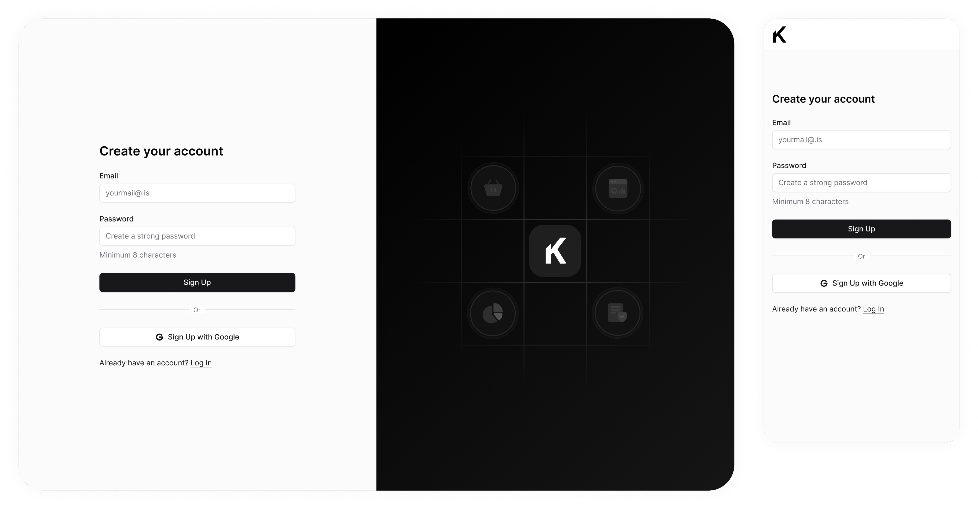
Step 0. Create your account.
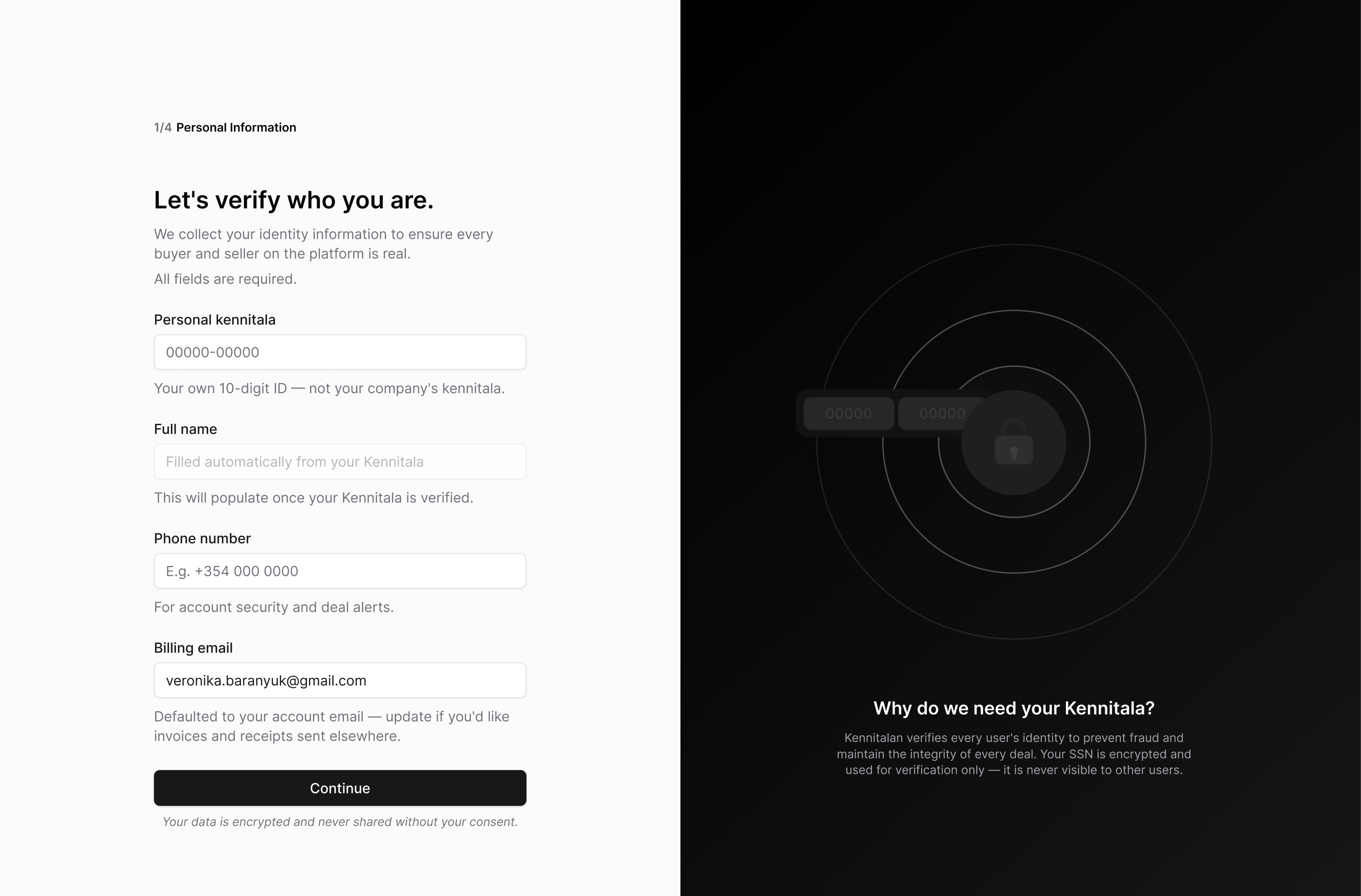
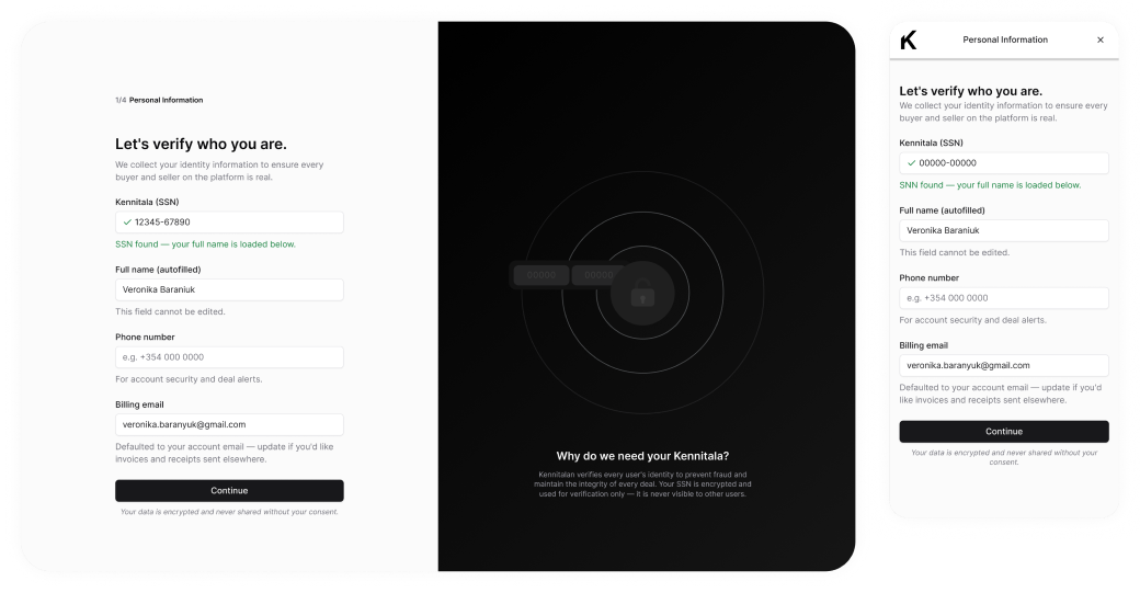
Step 1. Personal information
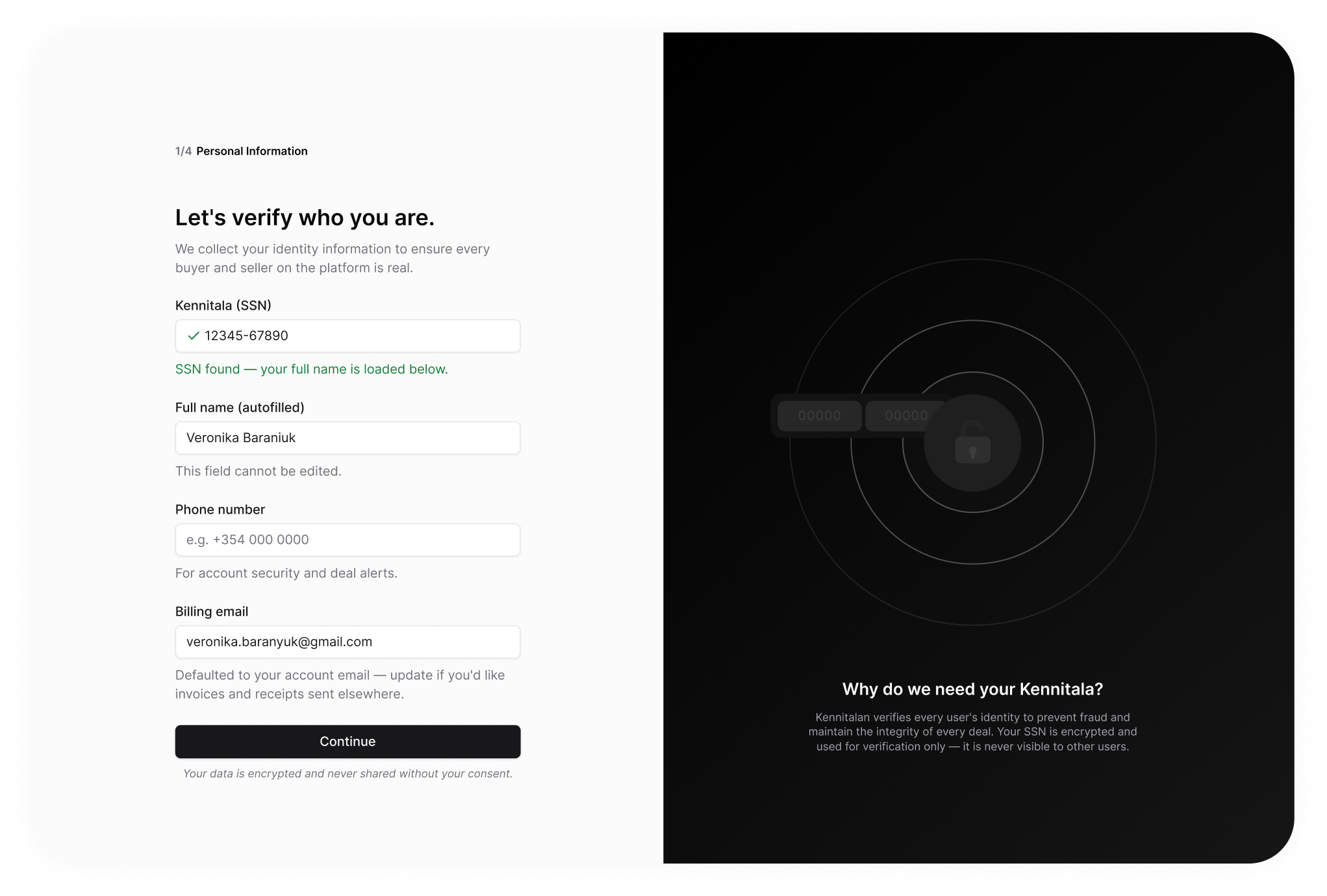
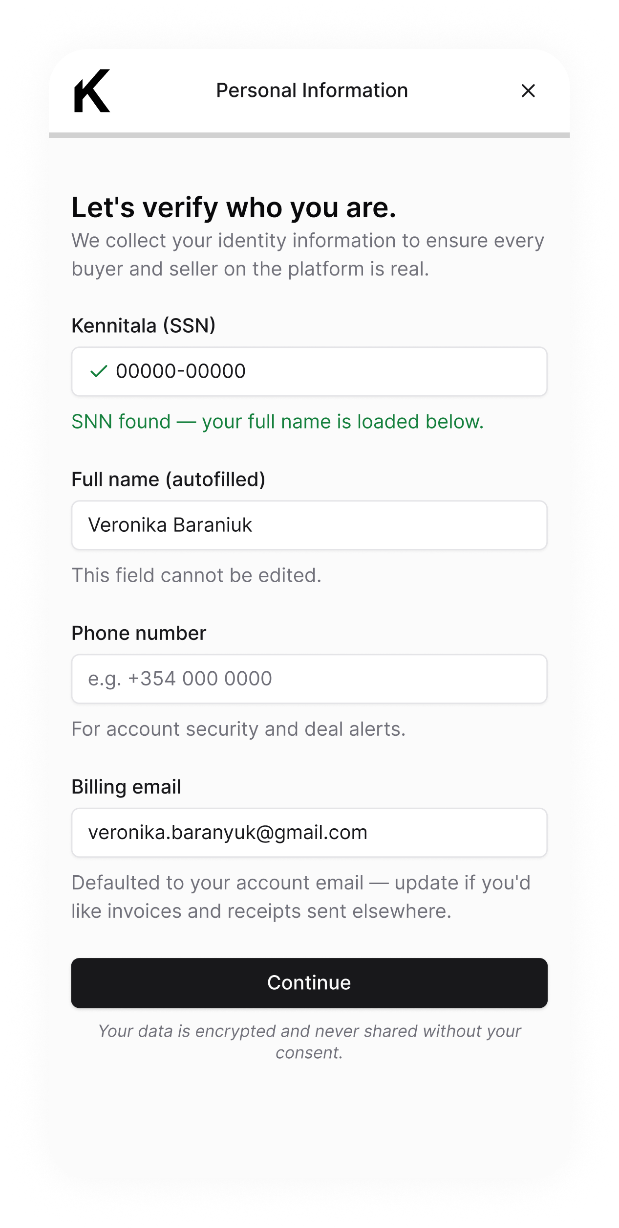
Collects identity, including the kennitala (national ID). Every sensitive field is justified in place, and a side panel — "Why do we need your Kennitala?" — explains it's encrypted, verification-only, and never visible to other users.
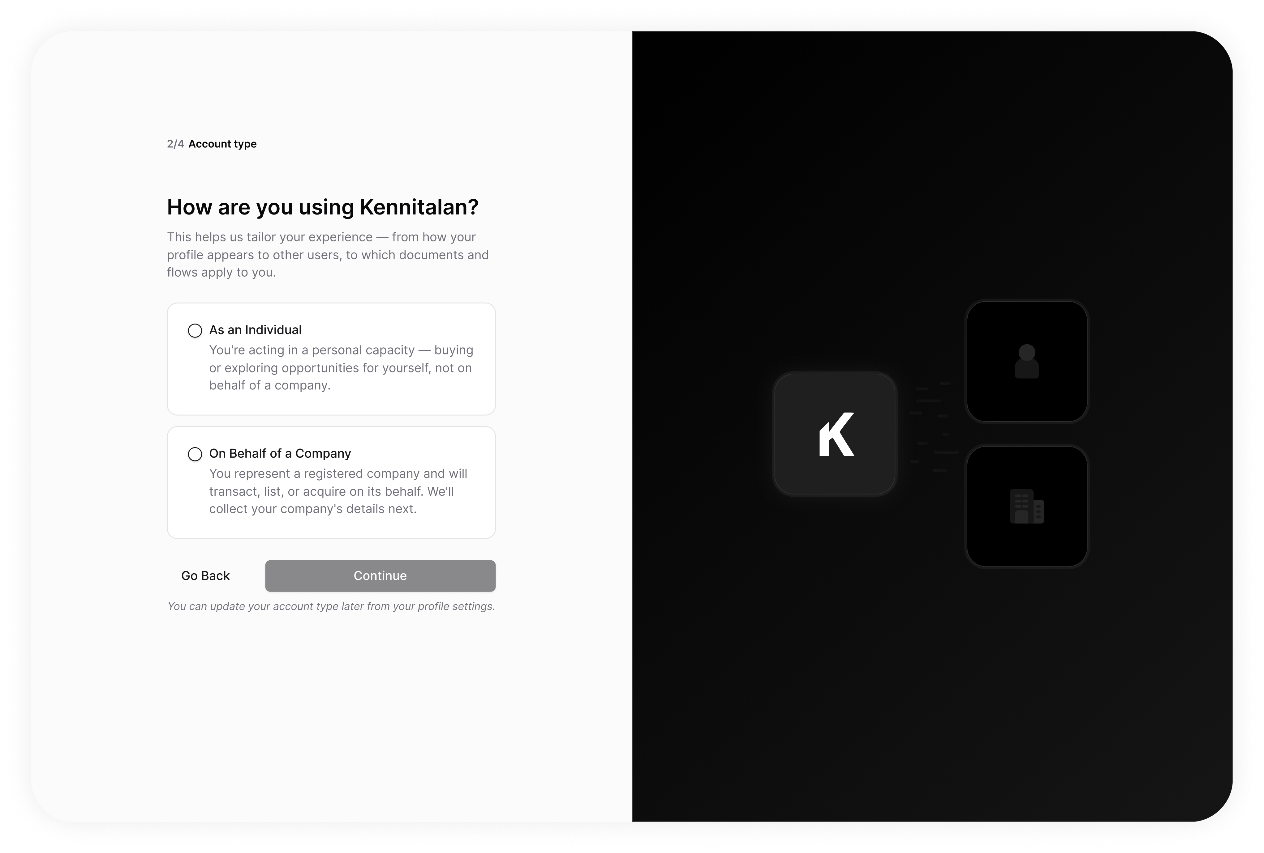
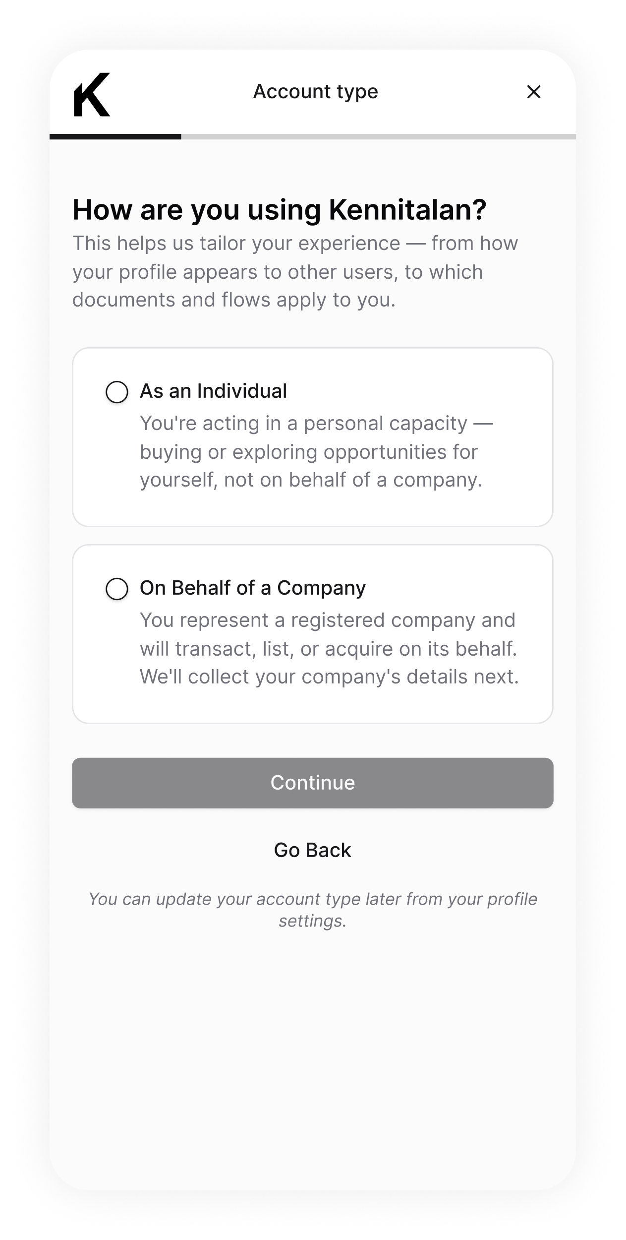
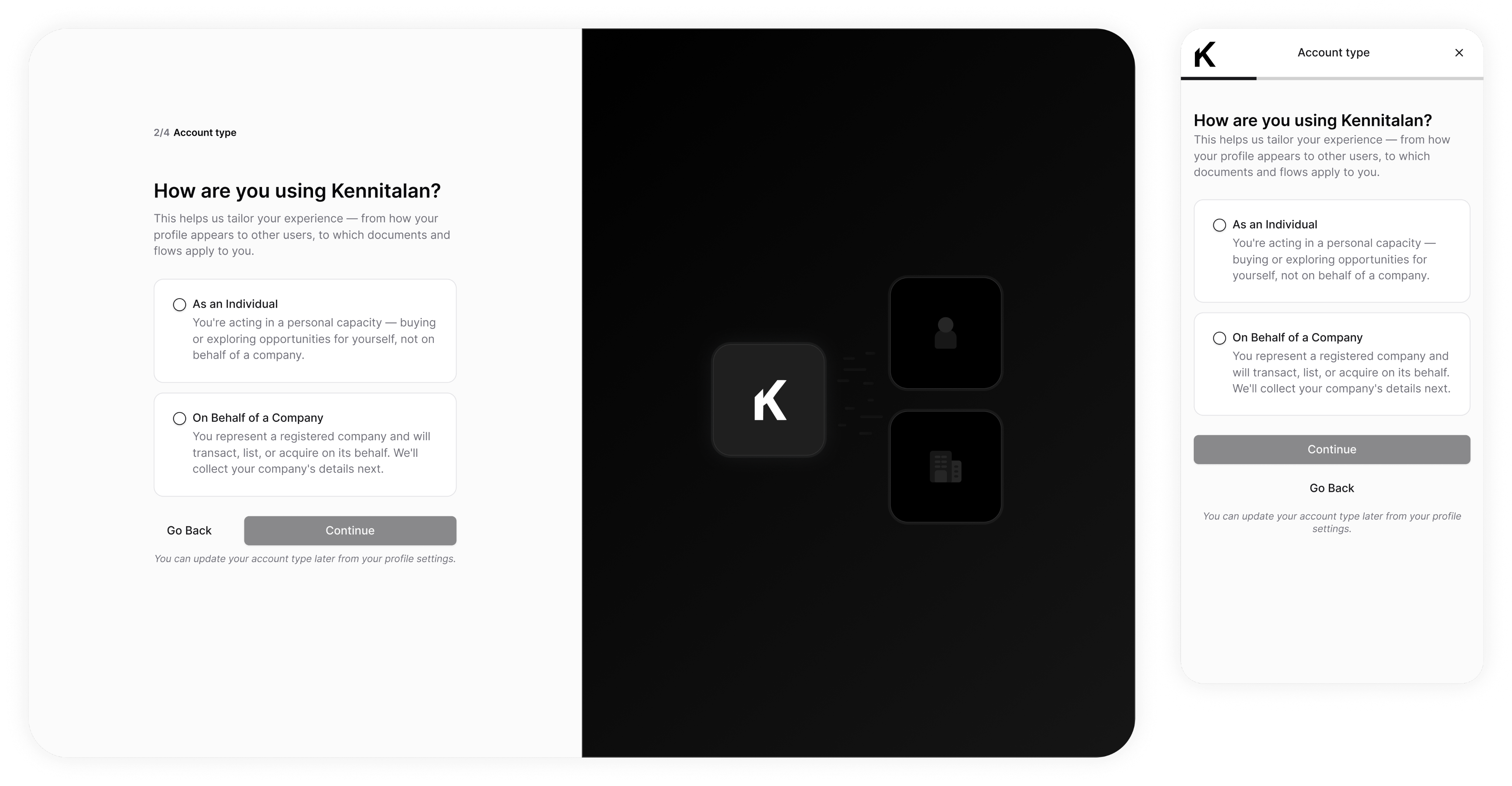
Step 2. Account type
Sets whether you're acting as an individual or a company — which shapes how your profile appears and which documents and flows apply later (there’s a signing an NDA flow, for example, that depends on the account type).
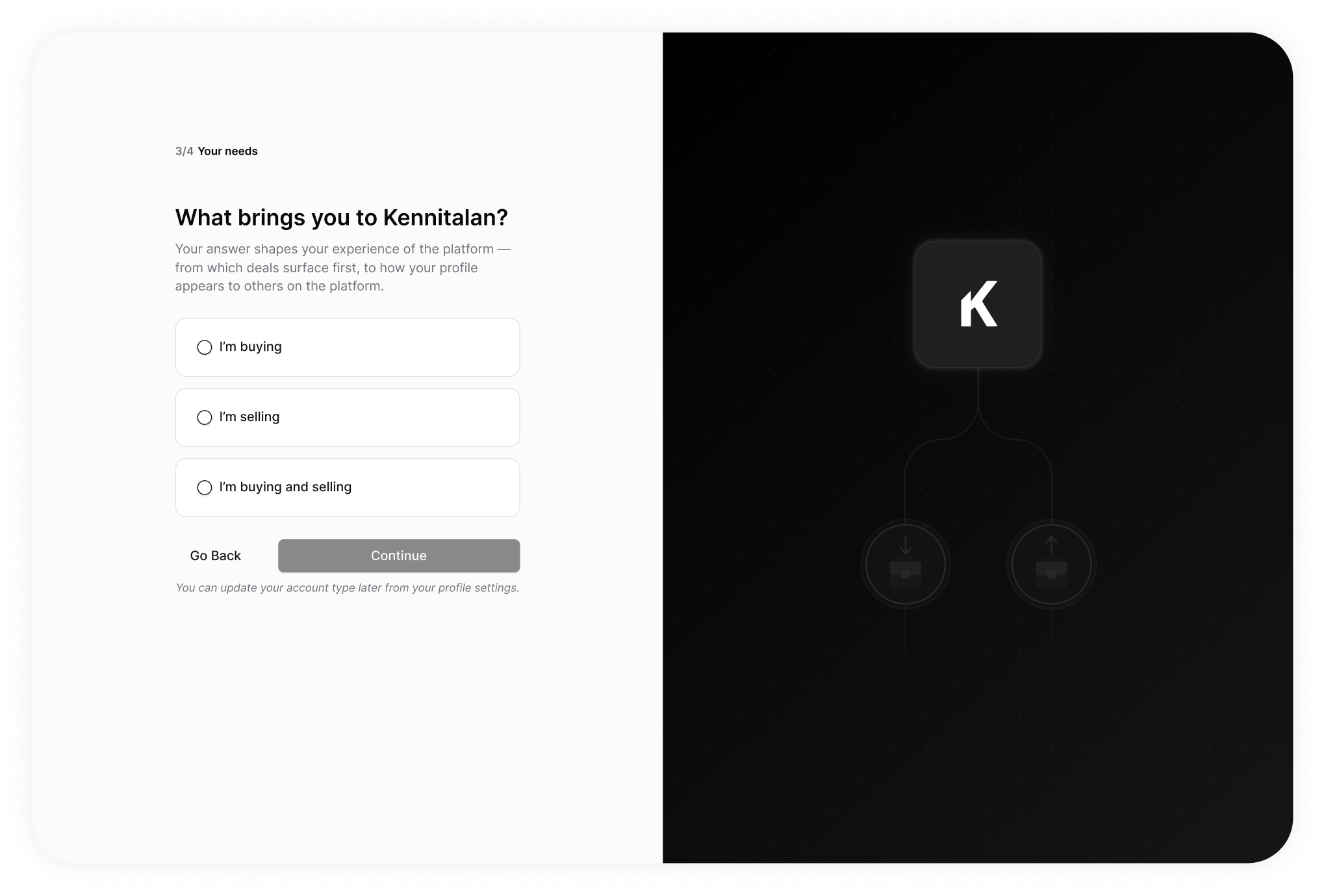
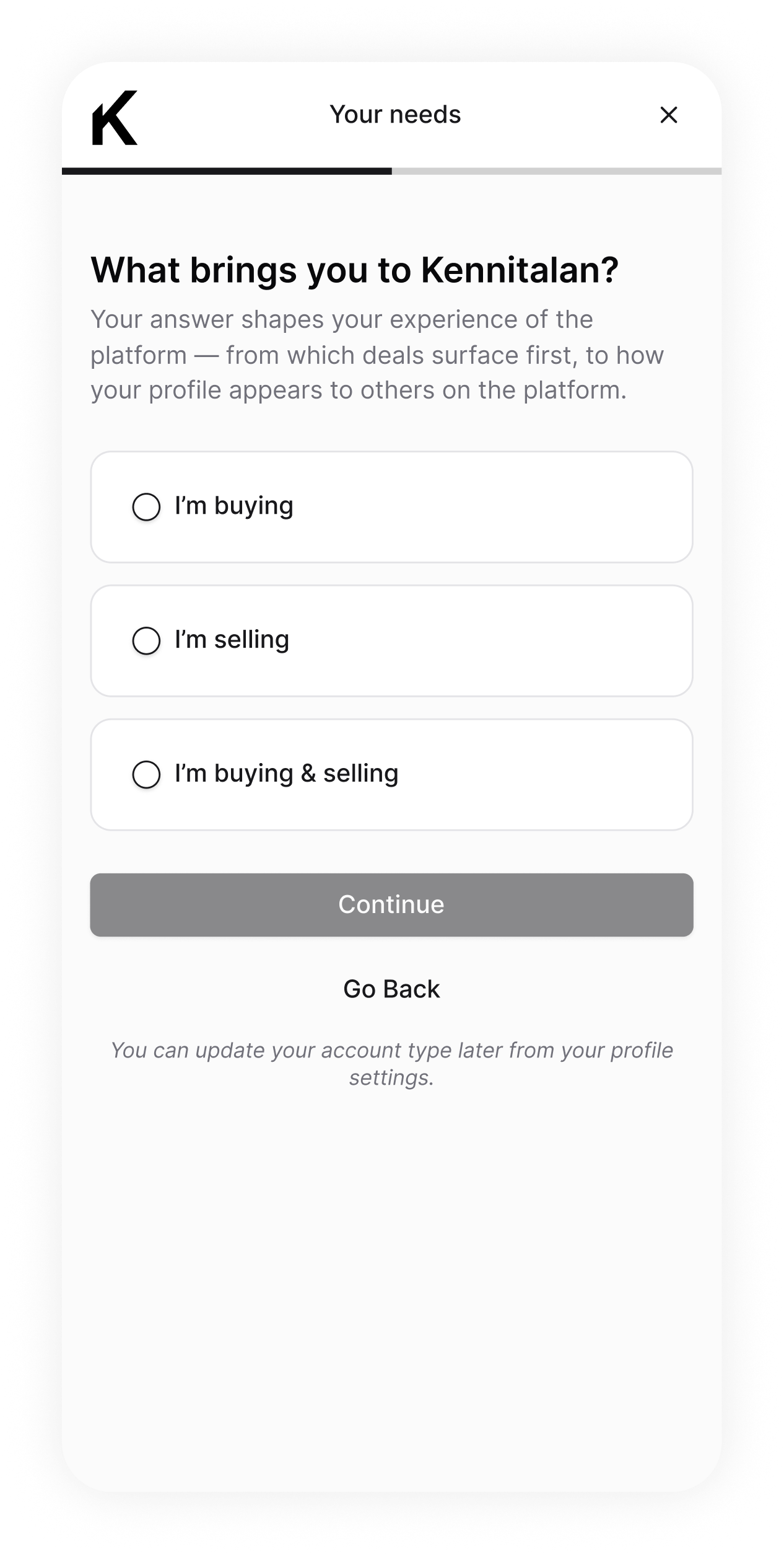
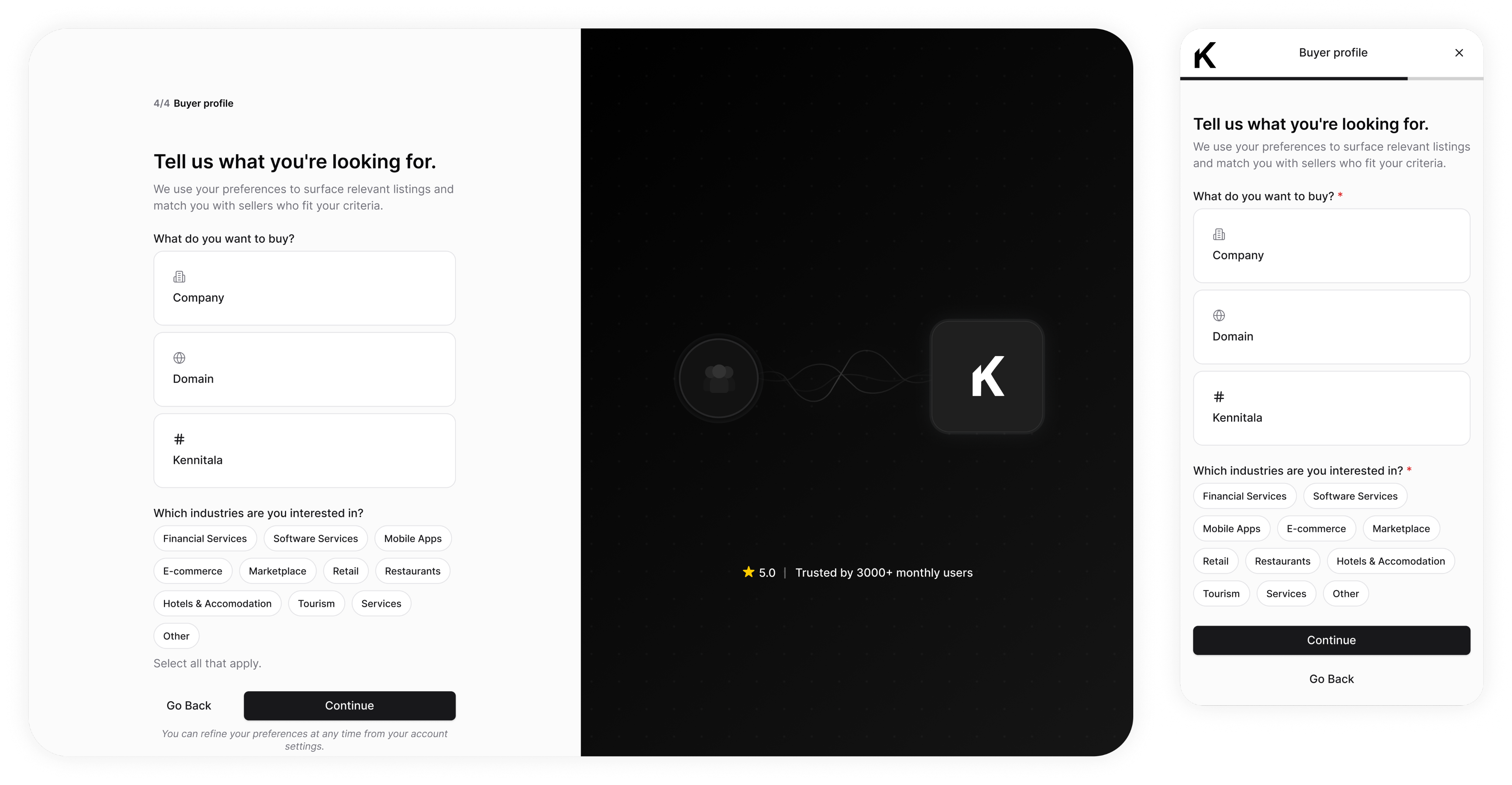
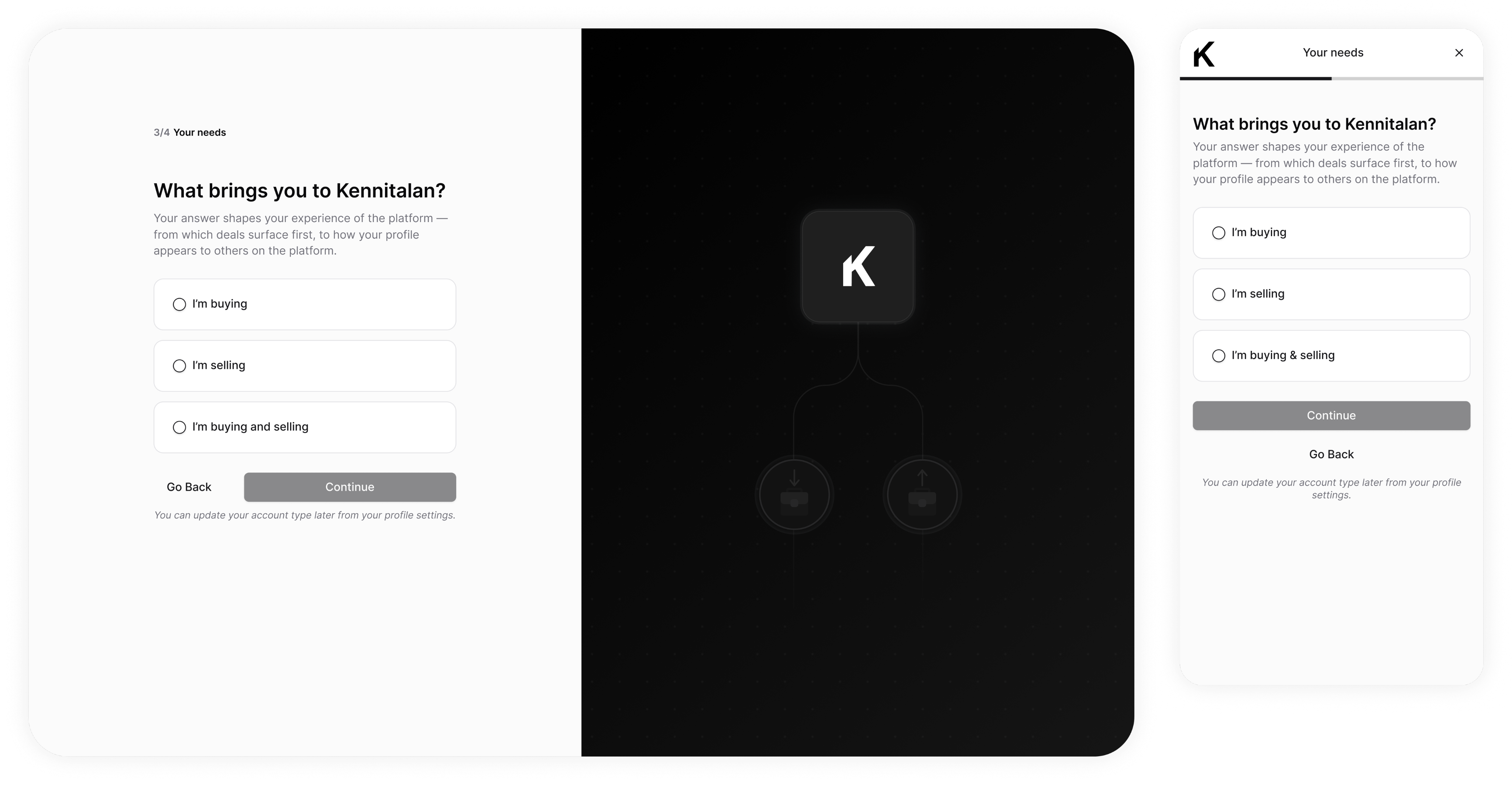
Step 3. Your needs
This is the fork. It's the step shaped around one goal: getting each person to the action that actually matters to them.
Step 4. Buyer, Seller, Buyer & Seller profiles
Buyer — these answers tailor the experience, activate the user, and let us follow up with relevant emails that bring them back.Seller — if they don't list next, we send emails tailored with niche stats, so the info is relevant to them, and motivates them to list.
Before: Sign Up
1
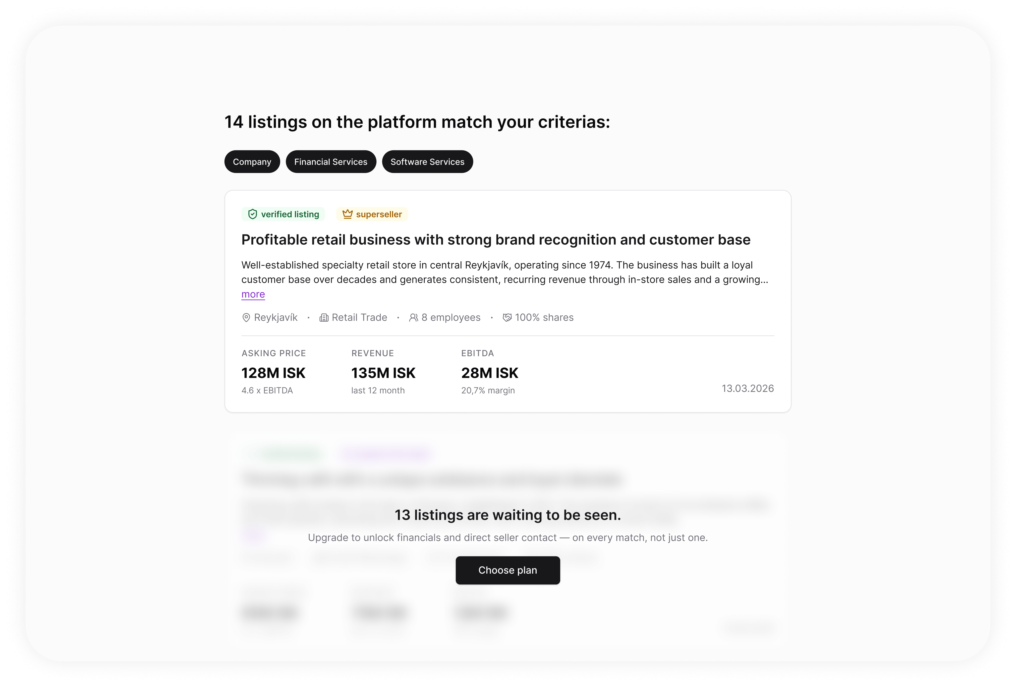
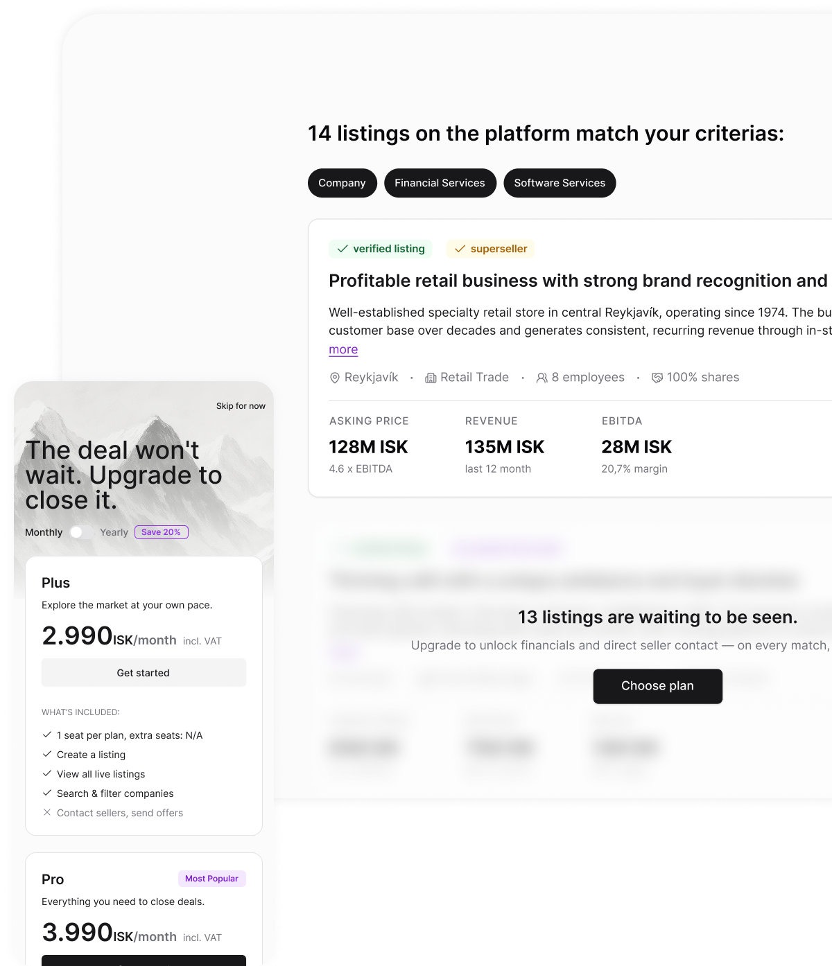
Step 4a. Upgrade (buyer, buyer&seller profiles only)
Activation — we show one full listing with the price ungated, so the value's clear. Then the banner upsells the rest: 13 more matches, one plan away.
Activation step
1
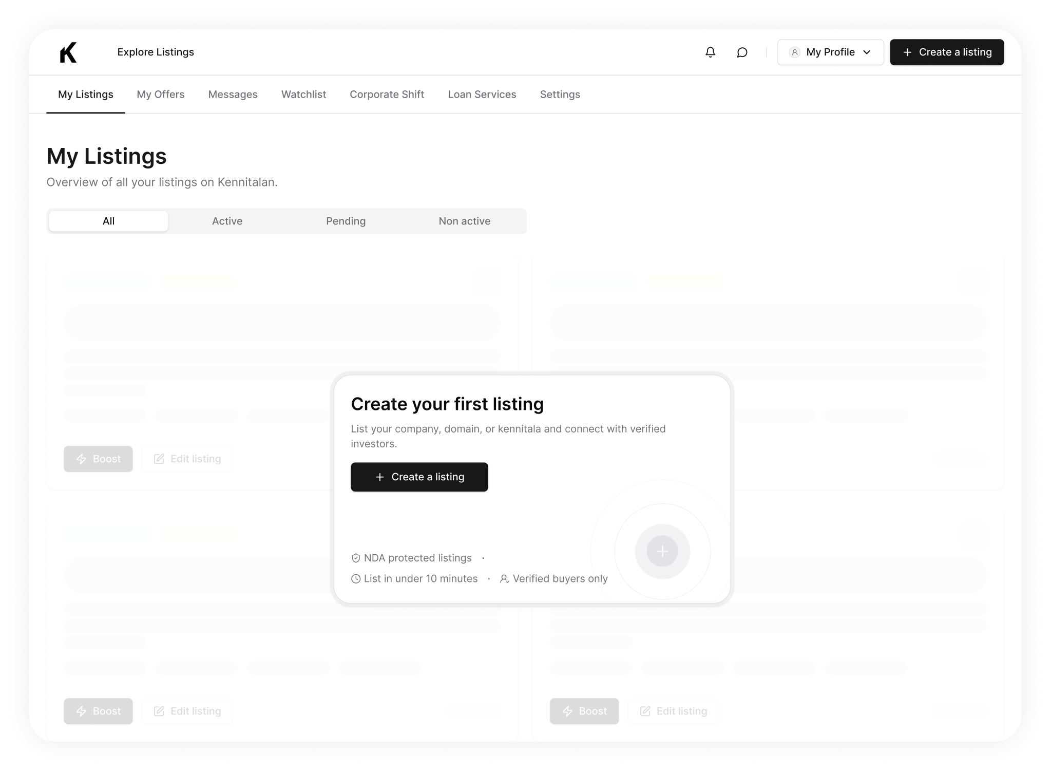
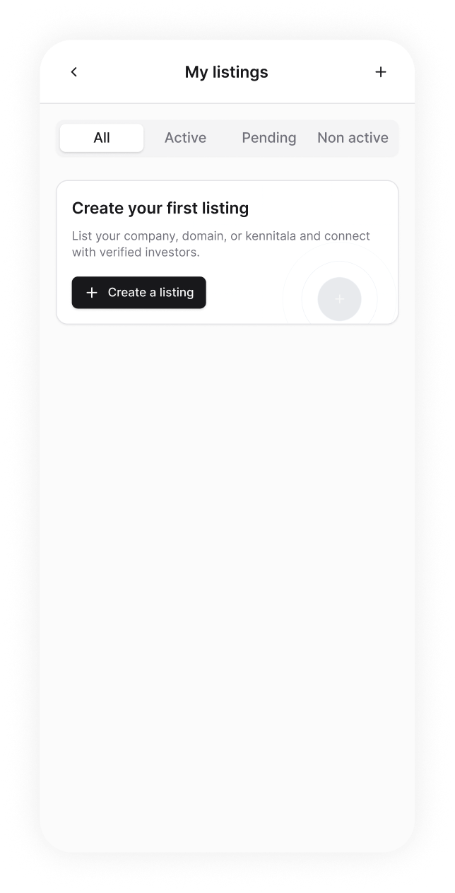
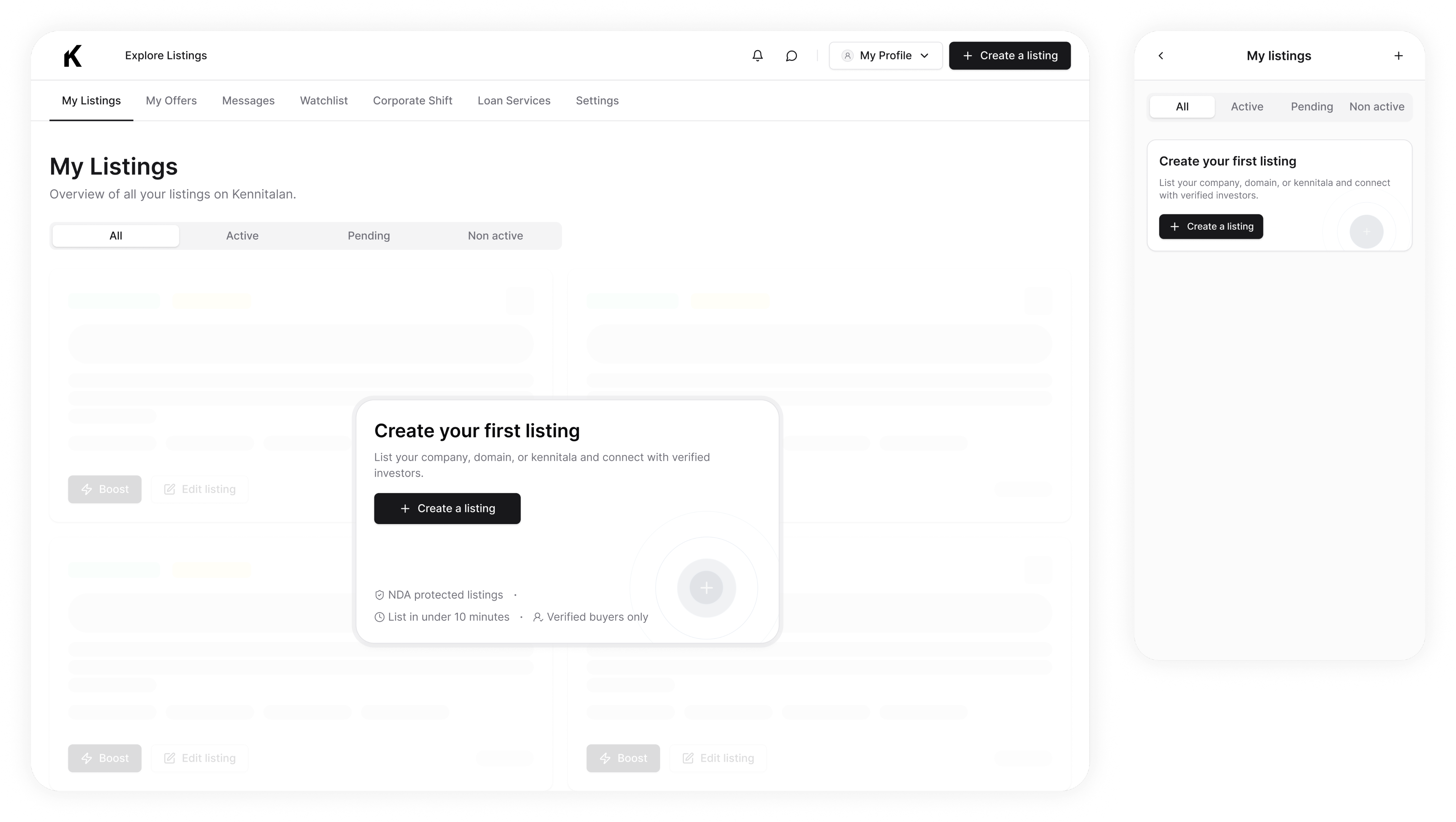
Step 5. Seller lands on Create a listing page
The seller lands exactly where they need to be: an empty My Listings, with one clear next step.
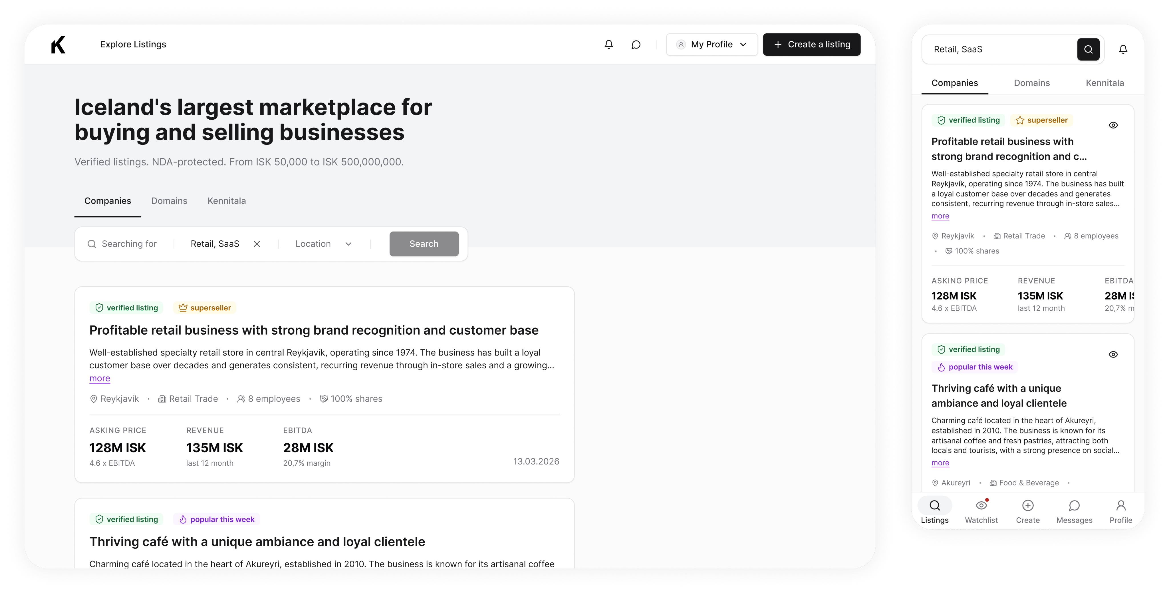
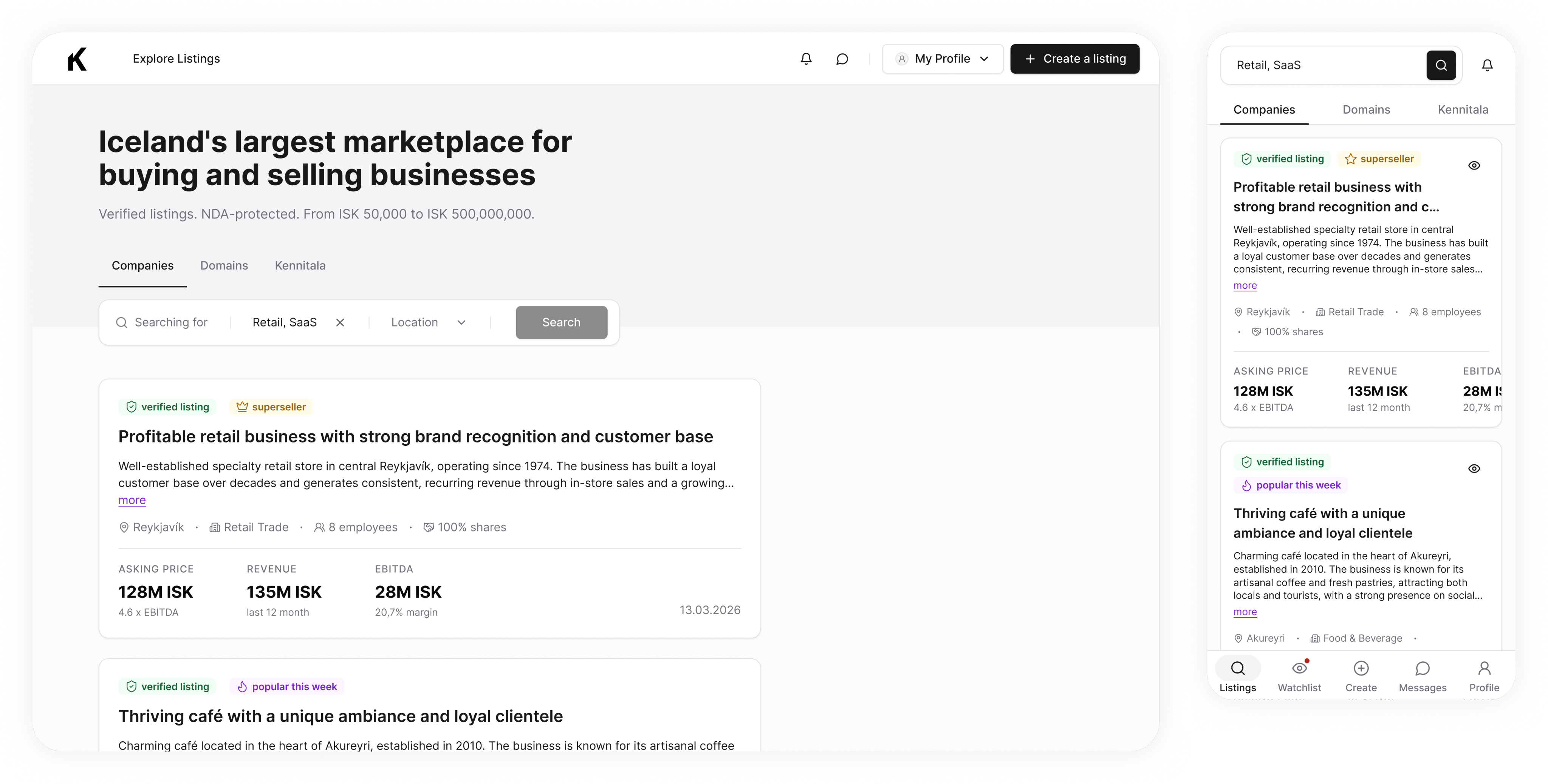
Step 5. Buyer lands on the Listings page (page view depends on the subscription type)
Buyer — the Listings page, but the view depends on the plan. Subscribed users get the full thing: financials, seller contact, nothing gated.
Subscribed users
1
Iterations
Support tickets kept pointing to the same two screens. Here's what we changed.
Step 0
Showing which account they signed up with
Stakeholders set the rule: once a user starts onboarding, any new tab or return visit lands them back in onboarding — not the homepage — until they finish. Users don't get to leave and come back later.
On top of that, users who'd signed up with Google were trying to log back in with email and password, which just errored out. First fix was a "recently used" badge on the Google button — but that didn't solve it, since users still had to pick the right Google account from the popup themselves. So we went further: hinting the exact account they should click within the Google login flow.
Step 1
Two kennitala issues, two fixes
First issue: users were entering their company's kennitala instead of their personal one — so we changed the placeholder copy to make that clearer and added a clear error message for when it still happened.
Second issue: some users entering their kennitala were already registered in the system. Instead of just erroring, we showed them a login button right away so they could get straight to logging in.
Learnings
Error prevention and recovering as a main focus after release
You won't catch everything before launch. Budget time for error handling and be ready to respond fast.
Semi custom design system is the fastest way to launch
We used shadcn ds as a base and created extra components where needed which allowed us to implement design much faster.
Kennitalan

I acted as a solo Product designer
Onboarding
Business marketplace
April 2026
1 Project manager, 1 Dev, 1 Product owner
Turning browsers into paying customers for Iceland's leading business marketplace.
A full app redesign for Iceland's leading business marketplace. This study zooms in on one flow: the onboarding that added a paywall and routed buyers and sellers differently.
Context
Kennitalan is a marketplace for buying and selling businesses in Iceland.
When the company approached me, the goal was to automate the sales team's manual work and start earning on subscriptions. And everything had to be done as soon as possible, of course. Onboarding was one of the core flows we started with.
Problem
Before, there was no onboarding, therefore, lots of manual work, no personalization, very low conversions.
Before: Sign Up
1
Context
In the previous version, users signed up and landed on a settings page — no guidance, nothing tailored to why they'd come. Every path to value ran through Kennitalan's team: buyers had to be sent an invoice by hand to subscribe before they could see prices, while sellers waited for a callback to finish the listing. Nothing closed without a human in the loop, so only the most motivated users stuck around and few ever paid.
As the sole designer, I was responsible for turning that manual flow into onboarding that could stand on its own, and, activate.
Outcomes & impact
Users actually started converting into customers
Buyers tell us what they are looking for on the last step of the onboarding so the first listing they see is a real match with a real price. The upgrade banner comes right after — once the value is already on screen.
100% of manual data collection, gone
Onboarding that feeds re-engagement
Research
Buyers, sellers, and brokers walk in with different goals
I received a Word doc from the team of every question they'd been asking users. Since users were clearly coming in with different intents, we knew early on we'd need to fork the experience rather than build one generic flow.
I used AI to sort the questions into a rough lo-fi flow, then identified the information every user needs regardless of intent — that formed the first three mockup screens. I used Claude skills to audit the mockups against UX heuristics and design laws, perfecting them along the way.
From there, I mapped the flow against the three cohorts signing up and their JTBD:
- buyers (when I'm evaluating a company to acquire, I want to see the full listing details, so I can decide whether it's worth pursuing)
- sellers (when I list my company, I want to attract genuine interest from qualified buyers, so I can sell it on good terms)
- brokers, acting as both
Next, I looked at how other marketplaces — Flippa, Acquire, Upwork — solve two related problems: how they fork users by intent, and how they keep a long onboarding flow from losing people.
Context
Takeaway #1
Sellers had to list for free
Charging sellers would have starved the platform of the listings buyers come for and lead to churn on buyers side. So sellers list for free — and that supply is what makes a buyer subscription worth paying for.
Takeaway #2
Every extra question costs completion
The handed-over list had far more questions than onboarding could survive. Each one is a chance to drop off, so we kept only the fields the platform actually acts on and delivers value to the user — matching, verification — and cut the rest. Fewer questions, more people reaching the end.
Exploration
Not every product needs AI — part of the job is knowing when it earns its place.
The client wanted to try an AI-native, chat-led onboarding; I weighed it against what this flow had to get right, in priority order — trust (it asks for a national ID), fit (a 40+ primary audience rewards familiarity over novelty), and completeness (every required field captured cleanly). A guided flow won on all three.
Option A
AI native chat
On-trend: the direction the client was excited by, and modern on the surface.
Wrong for the audience: users skew 40+ and conservative — a chatbot reads as unfamiliar, not welcoming.
Breaks trust at the worst moment: only ~1 in 10 people are comfortable sharing sensitive data, and AI trust runs lowest in finance and personal-data contexts — exactly where a kennitala ask sits (Deloitte 2025; YouGov 2025).
Option B
Progressive, step-by-step (chosen)
Familiar: a considered, form-based flow that matches how this audience expects to give sensitive data.
Controlled path: conditional steps (intent → different later questions) keep everyone on a complete, valid flow.
Engineering cost of the branching: the conditional intent-split (buyer vs. seller paths) is genuinely more to build and maintain than a flat form or a single chat.
Final design
Step 0. Create your account.
Step 1. Personal information
Collects identity, including the kennitala (national ID). Every sensitive field is justified in place, and a side panel — "Why do we need your Kennitala?" — explains it's encrypted, verification-only, and never visible to other users.
Step 2. Account type
Sets whether you're acting as an individual or a company — which shapes how your profile appears and which documents and flows apply later (there’s a signing an NDA flow, for example, that depends on the account type).
Step 3. Your needs
This is the fork. It's the step shaped around one goal: getting each person to the action that actually matters to them.
Step 4. Buyer, Seller, Buyer & Seller profiles
Buyer — these answers tailor the experience, activate the user, and let us follow up with relevant emails that bring them back.Seller — if they don't list next, we send emails tailored with niche stats, so the info is relevant to them, and motivates them to list.
Buyer profile
1
Step 4a. Upgrade (buyer, buyer&seller profiles only)
Activation — we show one full listing with the price ungated, so the value's clear. Then the banner upsells the rest: 13 more matches, one plan away.
Activation step
1
Step 5. Seller lands on Create a listing page
The seller lands exactly where they need to be: an empty My Listings, with one clear next step.
Step 5. Buyer lands on the Listings page (page view depends on the subscription type)
Buyer — the Listings page, but the view depends on the plan. Subscribed users get the full thing: financials, seller contact, nothing gated.
Subscribed users
1
Iterations
Support tickets kept pointing to the same two screens. Here's what we changed.
Step 0
Showing which account they signed up with
Stakeholders set the rule: once a user starts onboarding, any new tab or return visit lands them back in onboarding — not the homepage — until they finish. Users don't get to leave and come back later.
On top of that, users who'd signed up with Google were trying to log back in with email and password, which just errored out. First fix was a "recently used" badge on the Google button — but that didn't solve it, since users still had to pick the right Google account from the popup themselves. So we went further: hinting the exact account they should click within the Google login flow.
Step 1
Two kennitala issues, two fixes
First issue: users were entering their company's kennitala instead of their personal one — so we changed the placeholder copy to make that clearer and added a clear error message for when it still happened.
Second issue: some users entering their kennitala were already registered in the system. Instead of just erroring, we showed them a login button right away so they could get straight to logging in.
Learnings
Error prevention and recovering as a main focus after release
You won't catch everything before launch. Budget time for error handling and be ready to respond fast.
Semi custom design system is the fastest way to launch
We used shadcn ds as a base and created extra components where needed which allowed us to implement design much faster.
Kennitalan
I acted as a solo Product designer
Onboarding
Business marketplace
April 2026
1 Project manager, 1 Dev, 1 Product owner
Turning browsers into paying customers for Iceland's leading business marketplace.
A full app redesign for Iceland's leading business marketplace. This study zooms in on one flow: the onboarding that added a paywall and routed buyers and sellers differently.
Context
Kennitalan is a marketplace for buying and selling businesses in Iceland.
When the company approached me, the goal was to automate the sales team's manual work and start earning on subscriptions. And everything had to be done as soon as possible, of course. Onboarding was one of the core flows we started with.
Problem
Before, there was no onboarding, therefore, lots of manual work, no personalization, very low conversions.
Before: Sign Up
1
Context
In the previous version, users signed up and landed on a settings page — no guidance, nothing tailored to why they'd come. Every path to value ran through Kennitalan's team: buyers had to be sent an invoice by hand to subscribe before they could see prices, while sellers waited for a callback to finish the listing. Nothing closed without a human in the loop, so only the most motivated users stuck around and few ever paid.
As the sole designer, I was responsible for turning that manual flow into onboarding that could stand on its own, and, activate.
Outcomes & impact
Users actually started converting into customers
Buyers tell us what they are looking for on the last step of the onboarding so the first listing they see is a real match with a real price. The upgrade banner comes right after — once the value is already on screen.
100% of manual data collection, gone
Onboarding that feeds re-engagement
Research
Buyers, sellers, and brokers walk in with different goals
I received a Word doc from the team of every question they'd been asking users. Since users were clearly coming in with different intents, we knew early on we'd need to fork the experience rather than build one generic flow.
I used AI to sort the questions into a rough lo-fi flow, then identified the information every user needs regardless of intent — that formed the first three mockup screens. I used Claude skills to audit the mockups against UX heuristics and design laws, perfecting them along the way.
From there, I mapped the flow against the three cohorts signing up and their JTBD:
- buyers (when I'm evaluating a company to acquire, I want to see the full listing details, so I can decide whether it's worth pursuing)
- sellers (when I list my company, I want to attract genuine interest from qualified buyers, so I can sell it on good terms)
- brokers, acting as both
Next, I looked at how other marketplaces — Flippa, Acquire, Upwork — solve two related problems: how they fork users by intent, and how they keep a long onboarding flow from losing people.
Context
Takeaway #1
Sellers had to list for free
Sellers are the supply, and many arrive just testing the waters — checking price, gauging interest. Charge them to list and both the tentative sellers and the listings disappear. So listing stays free; that supply is what a buyer subscription pays for.
Takeaway #2
Every extra question costs completion
The handed-over list had far more questions than onboarding could survive. Each one is a chance to drop off, so we kept only the fields the platform actually acts on and delivers value to the user — matching, verification — and cut the rest. Fewer questions, more people reaching the end.
Exploration
Not every product needs AI — part of the job is knowing when it earns its place.
The client wanted to try an AI-native, chat-led onboarding; I weighed it against what this flow had to get right, in priority order — trust (it asks for a national ID), fit (a 40+ primary audience rewards familiarity over novelty), and completeness (every required field captured cleanly). A guided flow won on all three.
Option A
AI native chat
On-trend: the direction the client was excited by, and modern on the surface.
Wrong for the audience: users skew 40+ and conservative — a chatbot reads as unfamiliar, not welcoming.
Breaks trust at the worst moment: only ~1 in 10 people are comfortable sharing sensitive data, and AI trust runs lowest in finance and personal-data contexts — exactly where a kennitala ask sits (Deloitte 2025; YouGov 2025).
Option B
Progressive, step-by-step (chosen)
Familiar: a considered, form-based flow that matches how this audience expects to give sensitive data.
Controlled path: conditional steps (intent → different later questions) keep everyone on a complete, valid flow.
Engineering cost of the branching: the conditional intent-split (buyer vs. seller paths) is genuinely more to build and maintain than a flat form or a single chat.
Final design
Step 0. Create your account.
Final design + Iterations
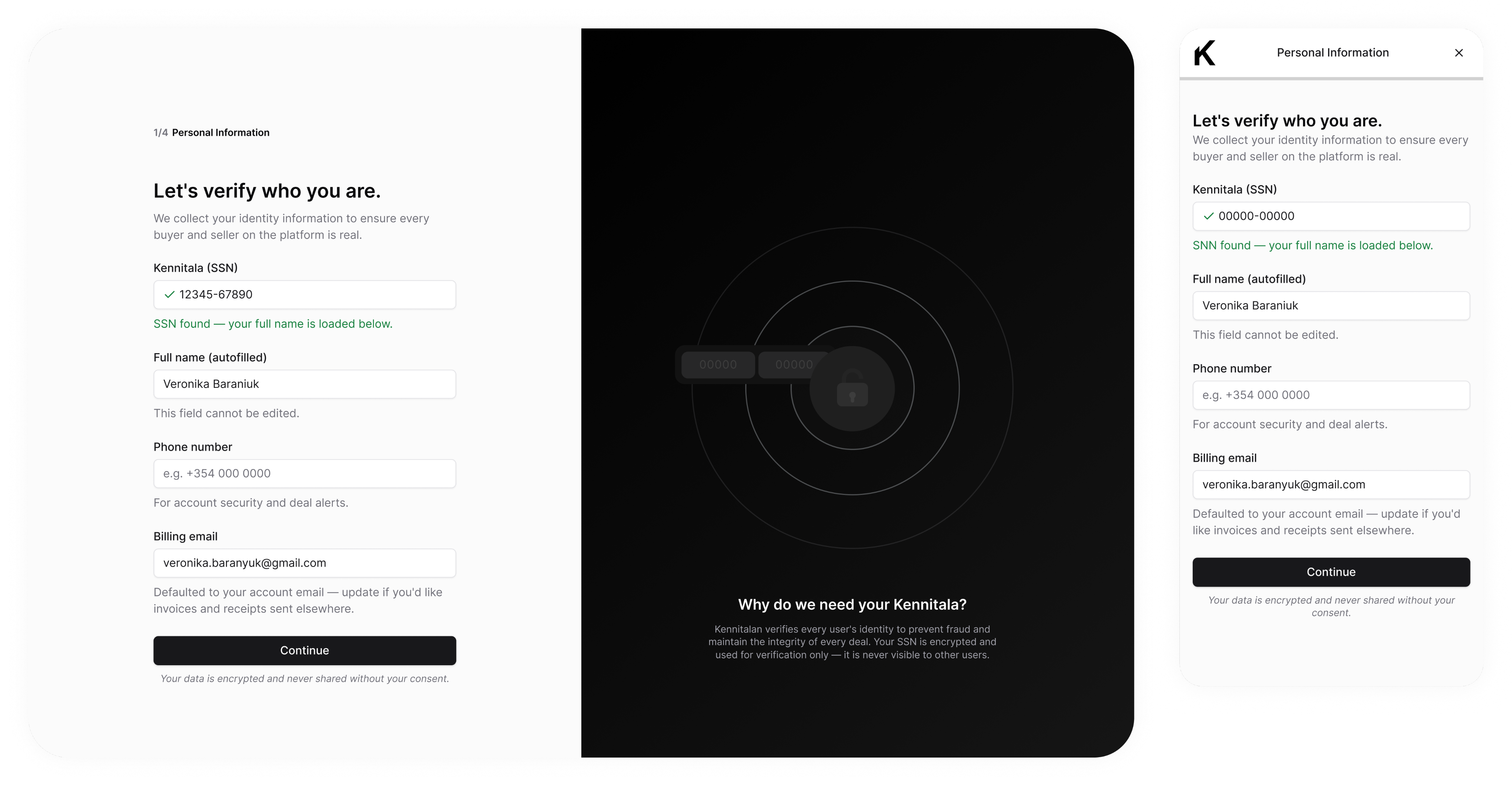
Step 1. Personal information
Collects identity, including the kennitala (national ID). Every sensitive field is justified in place, and a side panel — "Why do we need your Kennitala?" — explains it's encrypted, verification-only, and never visible to other users.
Final design + Iterations
Step 2. Account type
Sets whether you're acting as an individual or a company — which shapes how your profile appears and which documents and flows apply later (there’s a signing an NDA flow, for example, that depends on the account type).
Final design + Iterations
Step 3. Your needs
This is the fork. It's the step shaped around one goal: getting each person to the action that actually matters to them.
Final design + Iterations
Step 4. Buyer, Seller, Buyer & Seller profiles
Buyer — these answers tailor the experience, activate the user, and let us follow up with relevant emails that bring them back.Seller — if they don't list next, we send emails tailored with niche stats, so the info is relevant to them, and motivates them to list.
Buyer profile
1
Final design + Iterations
Step 4a. Upgrade (buyer, buyer&seller profiles only)
Activation — we show one full listing with the price ungated, so the value's clear. Then the banner upsells the rest: 13 more matches, one plan away.
Activation step
1
Final design + Iterations
Step 5. Seller lands on Create a listing page
The seller lands exactly where they need to be: an empty My Listings, with one clear next step.
Final design + Iterations
Step 5. Buyer lands on the Listings page (page view depends on the subscription type)
Buyer — the Listings page, but the view depends on the plan. Subscribed users get the full thing: financials, seller contact, nothing gated.
Subscribed users
1
Iterations
Support tickets kept pointing to the same two screens. Here's what we changed.
Step 0
Showing which account they signed up with
Stakeholders set the rule: once a user starts onboarding, any new tab or return visit lands them back in onboarding — not the homepage — until they finish. Users don't get to leave and come back later.
On top of that, users who'd signed up with Google were trying to log back in with email and password, which just errored out. First fix was a "recently used" badge on the Google button — but that didn't solve it, since users still had to pick the right Google account from the popup themselves. So we went further: hinting the exact account they should click within the Google login flow.
Step 1
Two kennitala issues, two fixes
First issue: users were entering their company's kennitala instead of their personal one — so we changed the placeholder copy to make that clearer and added a clear error message for when it still happened.
Second issue: some users entering their kennitala were already registered in the system. Instead of just erroring, we showed them a login button right away so they could get straight to logging in.
Learnings
Error prevention and recovering as a main focus after release
You won't catch everything before launch. Budget time for error handling and be ready to respond fast.
Semi custom design system is the fastest way to launch
We used shadcn ds as a base and created extra components where needed which allowed us to implement design much faster.
Kennitalan