abstract painting

Mobile App / IOS Native Components

Designing Sync to deepen cycle awareness, boost retention and drive organic growth

Tools: Figma, FigJam, Miro, Zoom, UX Pilot, ChatGPT, Genway

My Role: Product Designer

Problem:

Women struggle to understand and manage fluctuating energy, mood, and productivity throughout their menstrual cycle, because most period apps only track dates instead of providing actionable, cycle-based guidance.

Solution:

Sync translates hormonal patterns into simple daily recommendations for energy, mood, and productivity — helping women live in alignment with their cycle rather than against it.

Results:

  • Increase of app's MAUs and retention rate through sticky feature implementation
  • CRO optimization across core apps functionality and Activation rate increase
  • 5/5 users successfully completed the key scenario during testing without any hints

Defining the Problem

Competitors Lack Credible Scientific Communication

  1. Onboarding flows across competitors are overly long and cognitively demanding.

Competitor’s research and User Interviews revealed that users often install these apps during the first day of their cycle — a high-fatigue, low-patience moment. This mismatch leads to high abandonment during onboarding.That’s why we made the onboarding shorter.

  1. Top competitors position themselves as doctor-recommended for credibility, but rarely communicate scientific depth.

We identified an opportunity to strengthen trust by integrating hormone-based data and evidence-backed insights, creating a bridge between medical credibility and everyday usability.

  1. Competitors personalize notifications effectively but lack true retention drivers.

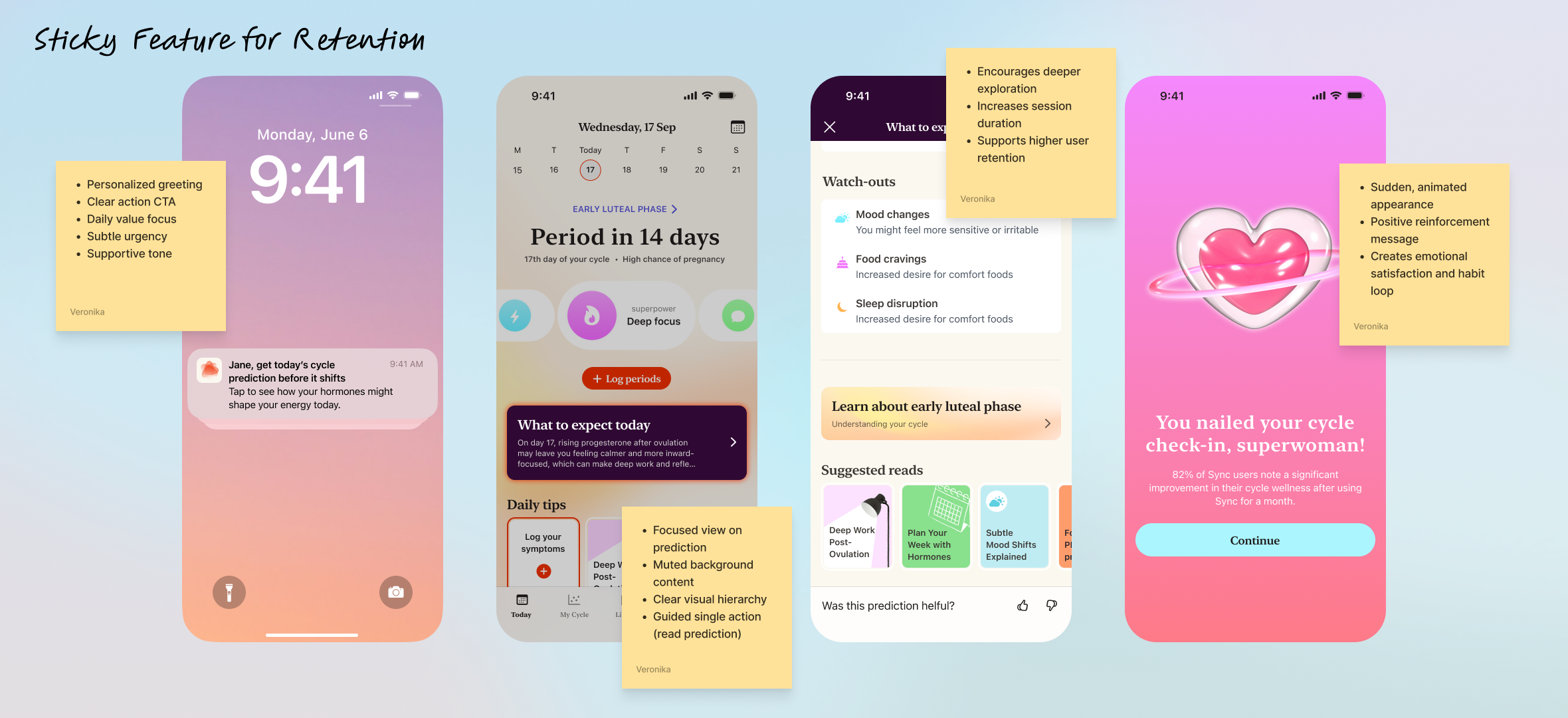
Through push strategy analysis, we found that apps like Flo excel in cohort-based personalization yet fail to build long-term stickiness.Since retention and value reinforcement were key goals for Sync, we introduced sticky features grounded in user praise and positive reinforcement to celebrate progress and strengthen emotional connection.
abstract painting

A personalized sticky feature that drives retention through daily predictions and positive reinforcement.

Fatigue and Mood Dips Are the Toughest Pain Points:

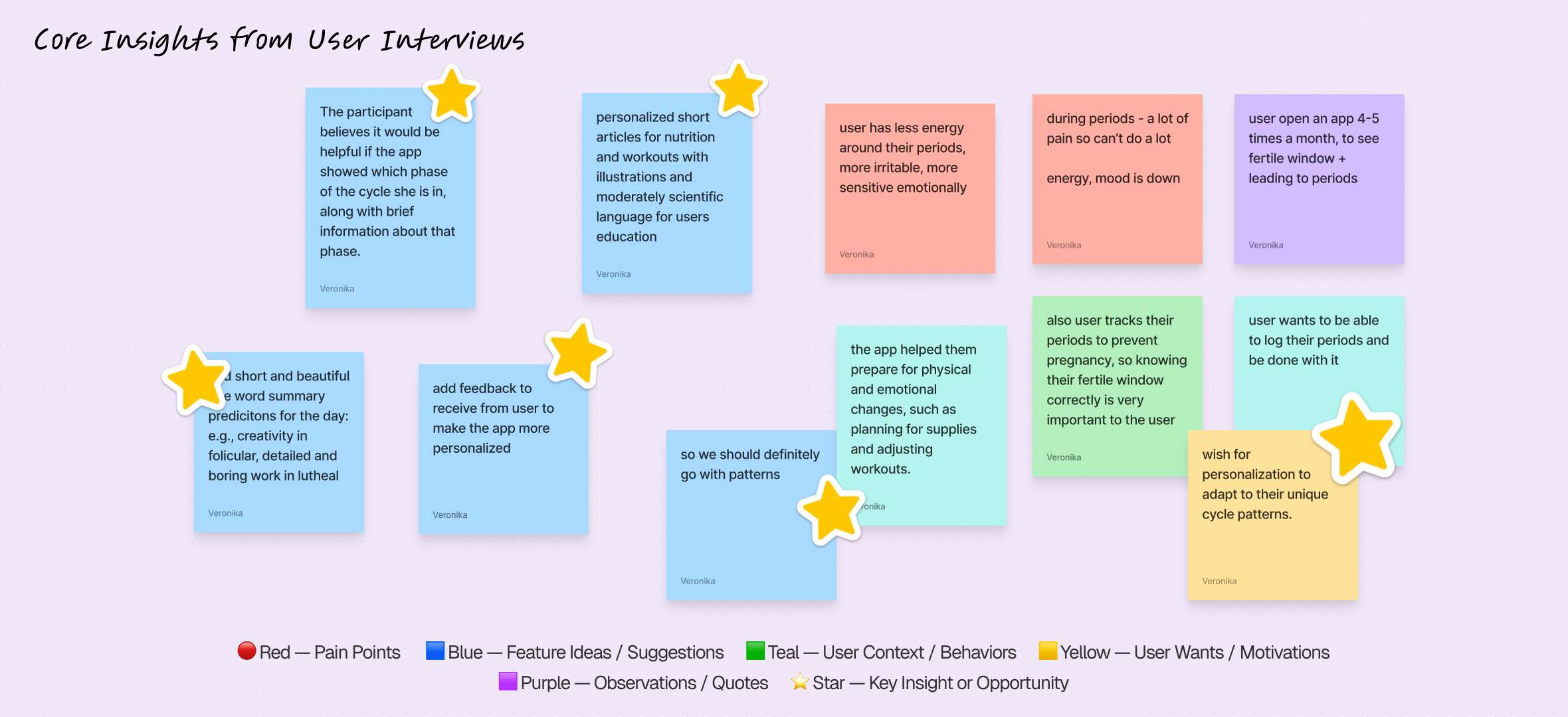
Key insights from five user interviews conducted via Zoom and analyzed in Maze. The findings were manually categorized into themes such as pain points, motivations, and behaviors, highlighting early feature ideas and opportunities for improvement in the cycle tracking experience.

  1. Daily prediction cards or reminders focused on energy + nutrition, to align lifestyle choices with energy levels, improving productivity and well-being.

Users want a simple, visual way to understand their energy levels and plan workouts, meals, and rest around their cycle. They seek personalized, supportive tips and accurate predictions that feel relevant to their daily life — empowering them without feeling medical or complicated.

  1. Helping women see their patterns, not just their periods

Users feel current apps lack personalized guidance and fail to adjust to their unique needs or patterns. They struggle to see clear progress or direction — which is why we added a Report section in a separate tab, where women can clearly see symptom patterns and log new symptoms to receive more personalized guidance over time.

  1. Fatigue and mood dips before menstruation are the most common pain points, with women seeking clearer guidance on how to adapt.

That’s why we introduced AI-powered daily pro tips, personalized by cycle phase and symptoms, to help women manage their hormonal health and feel connected to their bodies. We also added a fun Story-sharing feature to boost engagement and drive organic growth.
abstract painting

Here are some of the core user interviews insights.

“I feel like women have very, very different, uh, types of how they can be on their cycles. So I think a heavy personalization that could be done with AI would be the best approach.”
abstract painting

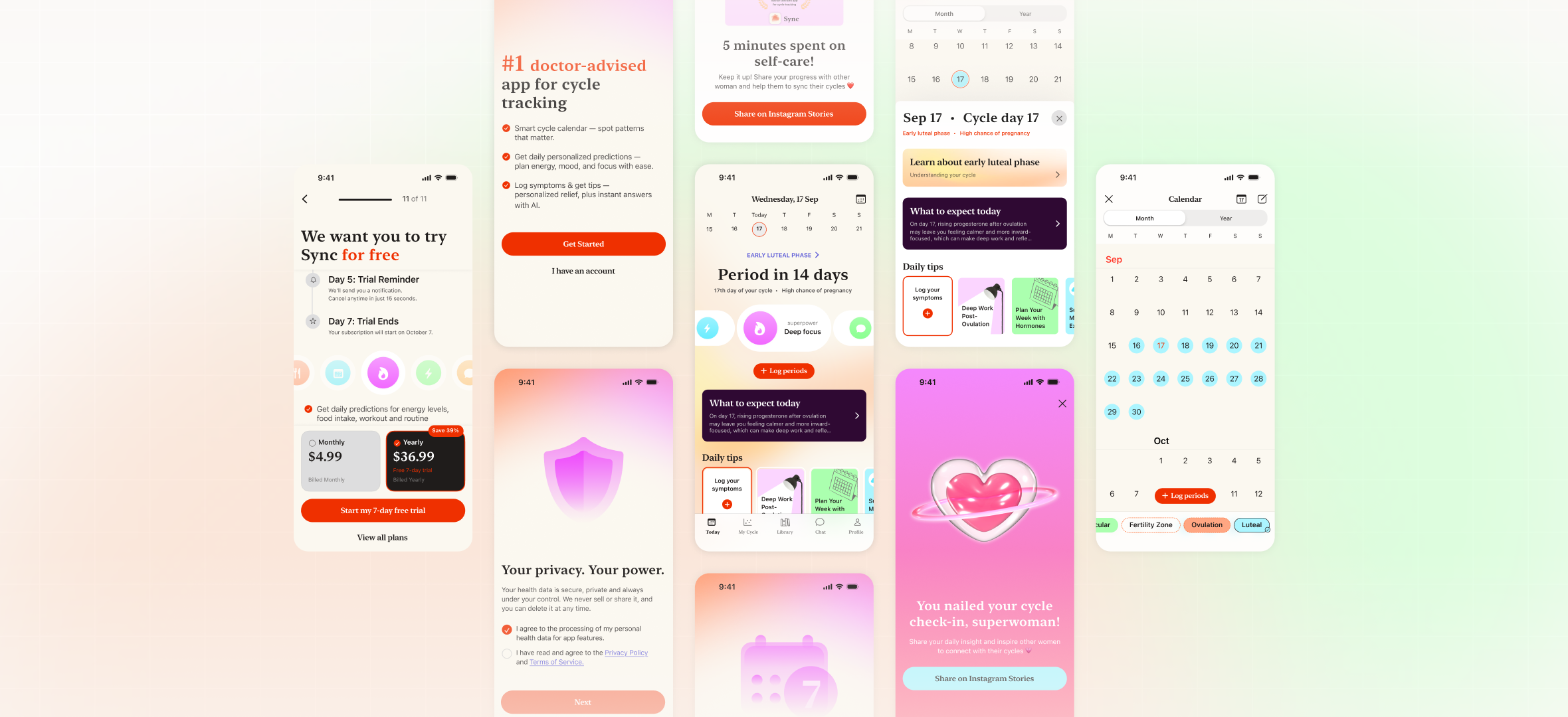
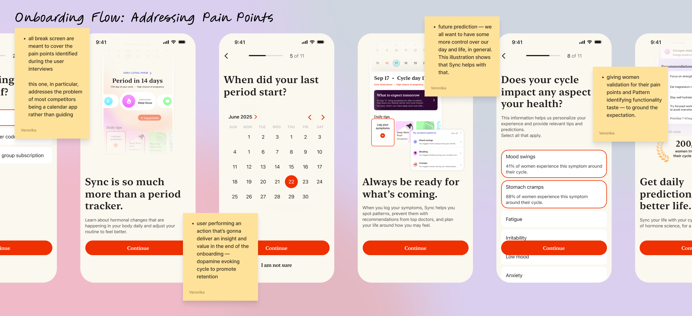
Onboarding Flow: Few simple questions to keep the process calm and quick, especially for women discovering the app during menstruation. A progress bar shows where they are in the flow.

CJM & User flow:
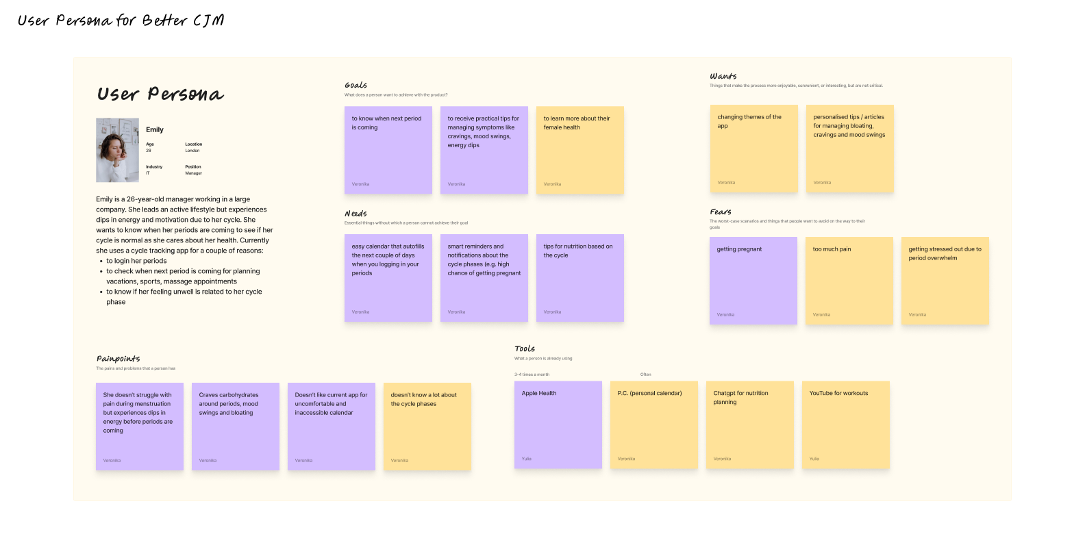
This persona highlights users’ need for personalized, easy-to-use cycle tracking with smart reminders, nutrition tips, and mood insights — helping them plan their days and feel more in control of their energy.

Insights from CJM:

  1. Build Trust Through Transparency

Users are cautious about data sharing and AI use. Clearly explain why data is collected, show trust signals, and reassure them that their information is secure and never sold.

  1. Make Onboarding Effortless and Empathetic

Ask only essential questions, include a progress bar, and allow skipping additional steps. A calm, quick onboarding creates comfort — especially during menstruation.

  1. Communicate Science With Empathy

Educate users about hormones and mood in simple, relatable language. Focus on self-care and empowerment to make the experience supportive and uplifting.

  1. Encourage Engagement and Organic Growth

Add shareable templates and a referral option to help users celebrate progress and spread awareness. Beautiful visuals and clear App Store materials drive organic reach and trust.

abstract painting

This image shows the app’s calm onboarding and home flow with daily insights, energy summaries, and shareable recommendations to boost engagement.

abstract painting

A bit of boring stuff: Sitemap & User Flows

MVP

Insight: Celebrate the “Light” Screen

When users reach a positive state or completion moment, amplify the experience with warmth and encouragement. The more supported and seen a person feels, the more likely they are to stay engaged and convert. A celebrated user is a retained user.

abstract painting

JTBD: Logging periods

abstract painting

JTBD: Check current cycle phase

Depth Grows Over Time

While the app is positioned around “period guidance,” users’ curiosity expands. They often explore hormonal balance, productivity, and mood links later. Surfacing deeper educational content contextually keeps the app relevant beyond tracking.

abstract painting

JTBD: Get the free trial & Notifications allowed

abstract painting

Development

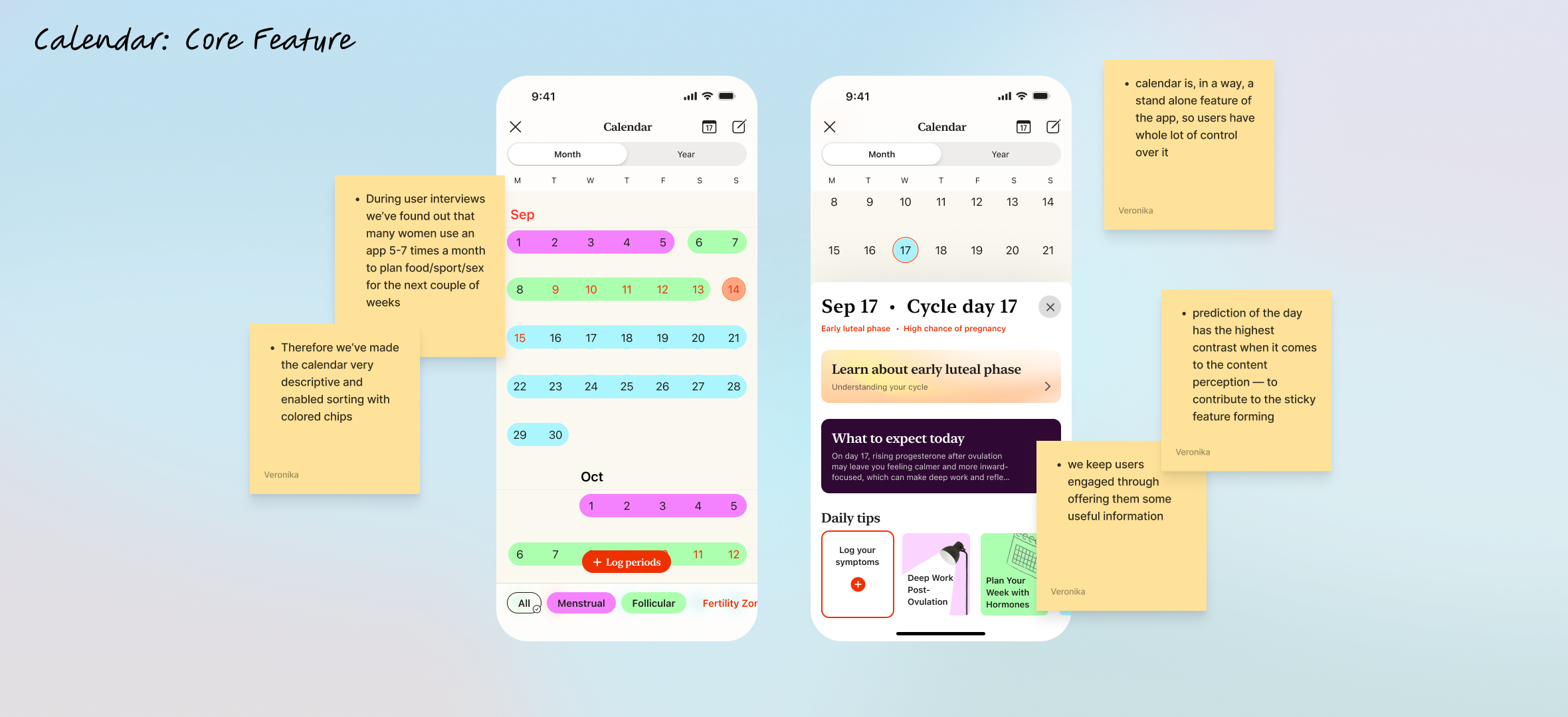
In order to fasten the development speed, we’ve used native IOS components but added some unique colors to it.

Learnings & Conclusions

  1. I’ve learned that AI can’t really replace the defining phase of UX Research.

I tried using Genway AI tool that conducts the interviews instead of you, yet it lacked the empathy at this stage of AI development. I do see a use of it for some hypotheses check for web design, but for Mobile App with heavy informational architecture Ai can’t be used as a serious resource.

  1. Same goes for wireframes. I tried UX pilot for generating the wireframes with IOS components, but those weren’t usable at all.

The fact that every line on the figma frame has a frame and #div, frustrating indeed.

  1. Native components are so great for the MVP

It takes you further. That’s where AI is getting sidetracked. In 5 minutes of IOS library components work, I am having a proper screen, ready for dev.

  1. The problem chosen is due to my experience with cycle syncing and this case study is being finished by now when I’m strongly hit by progesteron, therefore, very focused.

I wish to see this app coming to life. Please, connect ❤️

Thank you for staying!

Mobile App

Therapy App for Therapists and Their Clients

Coming Soon

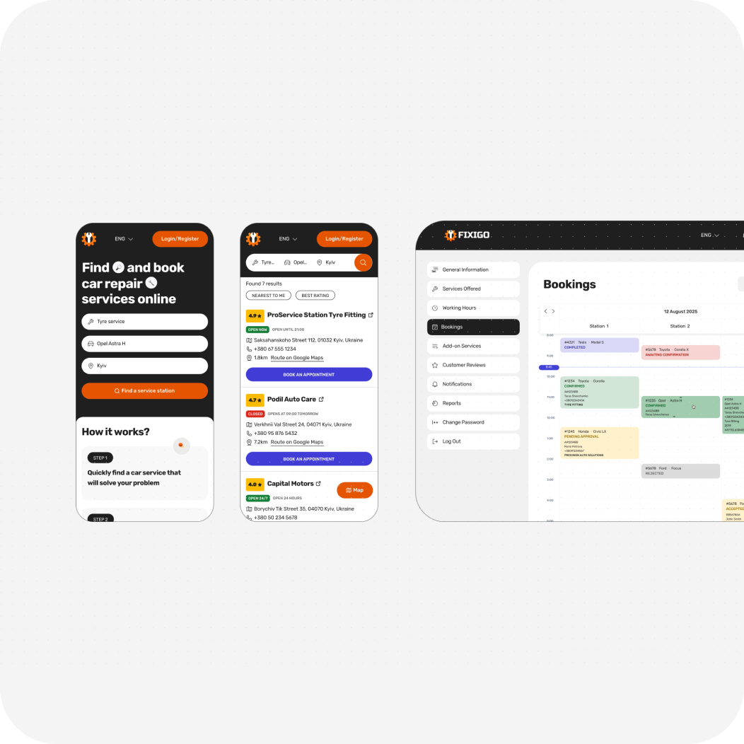
Mobile, Web / for Car Repair Shops & Car Owners

How a Clear Design System Cut 2 Weeks off Development Time: Car Repair CRM

Coming Soon

magazine spread
abstract painting

Mobile App / IOS Native Components

Designing Sync to deepen cycle awareness, boost retention and drive organic growth

Tools: Figma, FigJam, Miro, Zoom, UX Pilot, ChatGPT, Genway

My Role: Product Designer

Problem:

Women struggle to understand and manage fluctuating energy, mood, and productivity throughout their menstrual cycle, because most period apps only track dates instead of providing actionable, cycle-based guidance.

Solution:

Sync translates hormonal patterns into simple daily recommendations for energy, mood, and productivity — helping women live in alignment with their cycle rather than against it.

Results:

  • Increase of app's MAUs and retention rate through sticky feature implementation
  • CRO optimization across core apps functionality and Activation rate increase
  • 5/5 users successfully completed the key scenario during testing without any hints

Defining the Problem

Competitors Lack Credible Scientific Communication

  1. Onboarding flows across competitors are overly long and cognitively demanding.

Competitor’s research and User Interviews revealed that users often install these apps during the first day of their cycle — a high-fatigue, low-patience moment. This mismatch leads to high abandonment during onboarding.That’s why we made the onboarding shorter.

  1. Top competitors position themselves as doctor-recommended for credibility, but rarely communicate scientific depth.

We identified an opportunity to strengthen trust by integrating hormone-based data and evidence-backed insights, creating a bridge between medical credibility and everyday usability.

  1. Competitors personalize notifications effectively but lack true retention drivers.

Through push strategy analysis, we found that apps like Flo excel in cohort-based personalization yet fail to build long-term stickiness.Since retention and value reinforcement were key goals for Sync, we introduced sticky features grounded in user praise and positive reinforcement to celebrate progress and strengthen emotional connection.

abstract painting

A personalized sticky feature that drives retention through daily predictions and positive reinforcement.

Fatigue and Mood Dips Are the Toughest Pain Points:

Key insights from five user interviews conducted via Zoom and analyzed in Maze. The findings were manually categorized into themes such as pain points, motivations, and behaviors, highlighting early feature ideas and opportunities for improvement in the cycle tracking experience.

  1. Daily prediction cards or reminders focused on energy + nutrition, to align lifestyle choices with energy levels, improving productivity and well-being.

Users want a simple, visual way to understand their energy levels and plan workouts, meals, and rest around their cycle. They seek personalized, supportive tips and accurate predictions that feel relevant to their daily life — empowering them without feeling medical or complicated.

  1. Helping women see their patterns, not just their periods

Users feel current apps lack personalized guidance and fail to adjust to their unique needs or patterns. They struggle to see clear progress or direction — which is why we added a Report section in a separate tab, where women can clearly see symptom patterns and log new symptoms to receive more personalized guidance over time.

  1. Fatigue and mood dips before menstruation are the most common pain points, with women seeking clearer guidance on how to adapt.

That’s why we introduced AI-powered daily pro tips, personalized by cycle phase and symptoms, to help women manage their hormonal health and feel connected to their bodies. We also added a fun Story-sharing feature to boost engagement and drive organic growth.

abstract painting

Here are some of the core user interviews insights.

“I feel like women have very, very different, uh, types of how they can be on their cycles. So I think a heavy personalization that could be done with AI would be the best approach.”

abstract painting

Onboarding Flow: Few simple questions to keep the process calm and quick, especially for women discovering the app during menstruation. A progress bar shows where they are in the flow.

CJM & User flow:

This persona highlights users’ need for personalized, easy-to-use cycle tracking with smart reminders, nutrition tips, and mood insights — helping them plan their days and feel more in control of their energy.

Insights from CJM:

  1. Build Trust Through Transparency

Users are cautious about data sharing and AI use. Clearly explain why data is collected, show trust signals, and reassure them that their information is secure and never sold.

  1. Make Onboarding Effortless and Empathetic

Ask only essential questions, include a progress bar, and allow skipping additional steps. A calm, quick onboarding creates comfort — especially during menstruation.

  1. Communicate Science With Empathy

Educate users about hormones and mood in simple, relatable language. Focus on self-care and empowerment to make the experience supportive and uplifting.

  1. Encourage Engagement and Organic Growth

Add shareable templates and a referral option to help users celebrate progress and spread awareness. Beautiful visuals and clear App Store materials drive organic reach and trust.
abstract painting

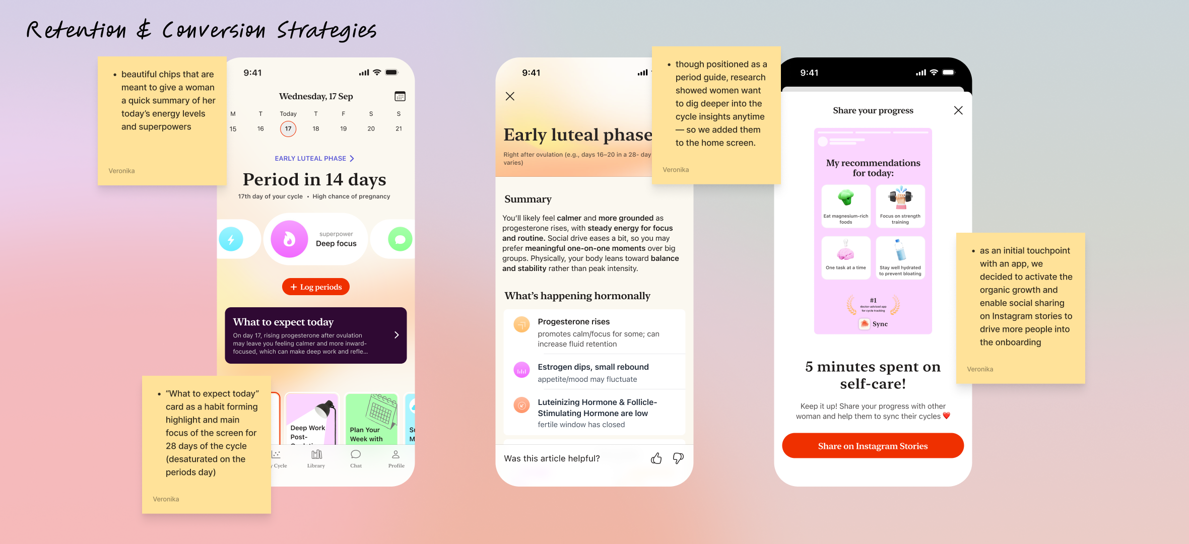
This image shows the app’s calm onboarding and home flow with daily insights, energy summaries, and shareable recommendations to boost engagement.
abstract painting

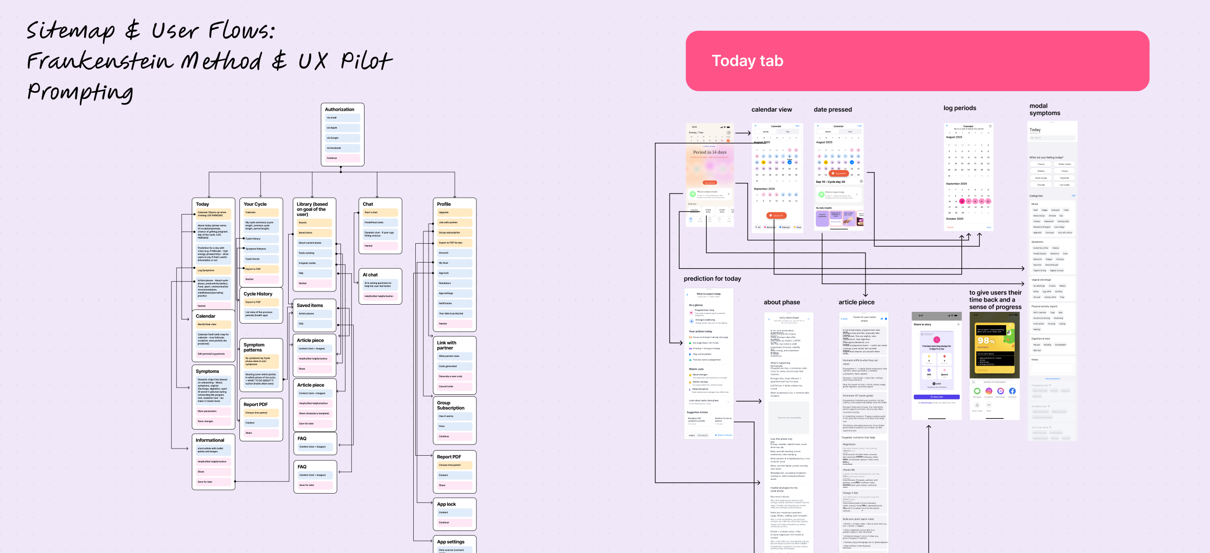
A bit of boring stuff: Sitemap & User Flows

MVP

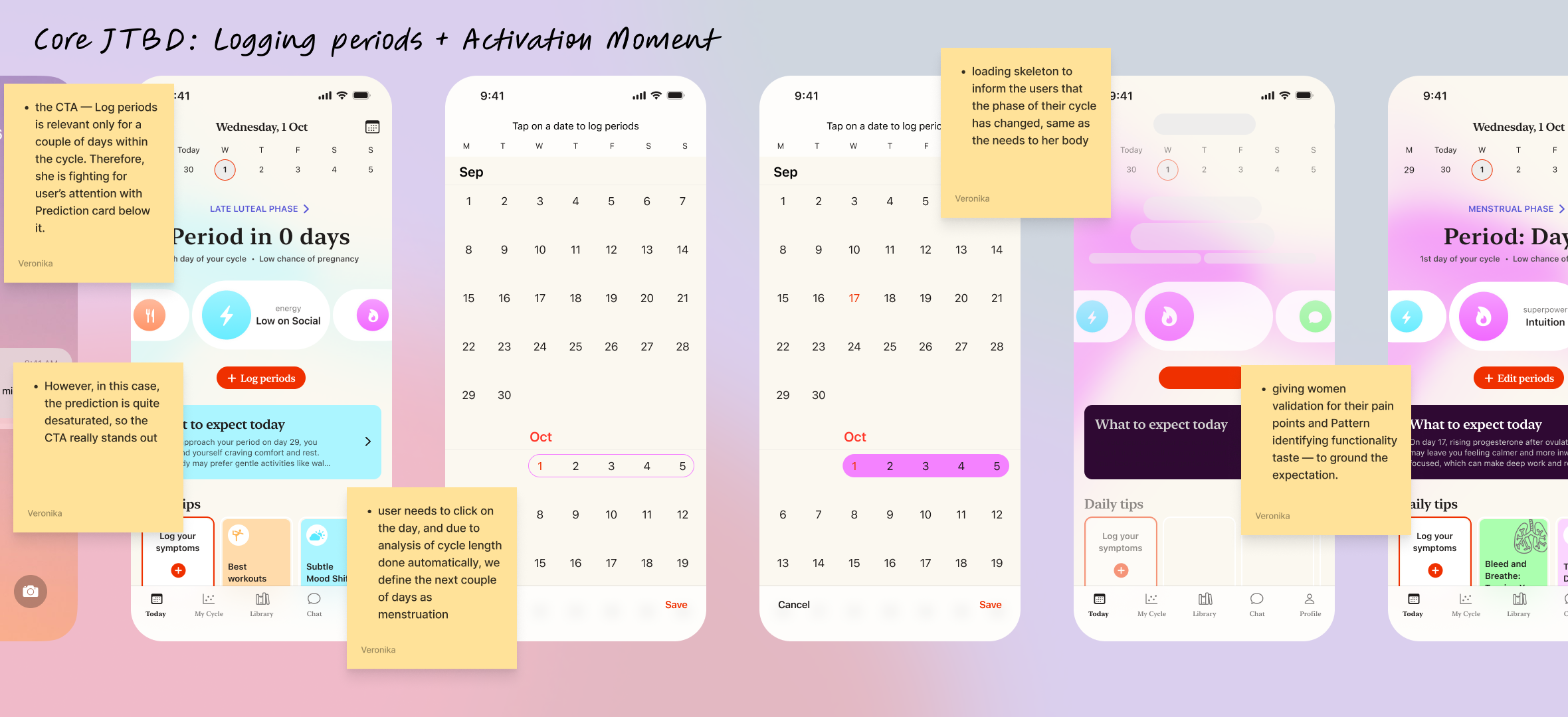
Insight: Celebrate the “Light” Screen

When users reach a positive state or completion moment, amplify the experience with warmth and encouragement. The more supported and seen a person feels, the more likely they are to stay engaged and convert. A celebrated user is a retained user.
abstract painting

JTBD: Logging periods

abstract painting

JTBD: Check current cycle phase

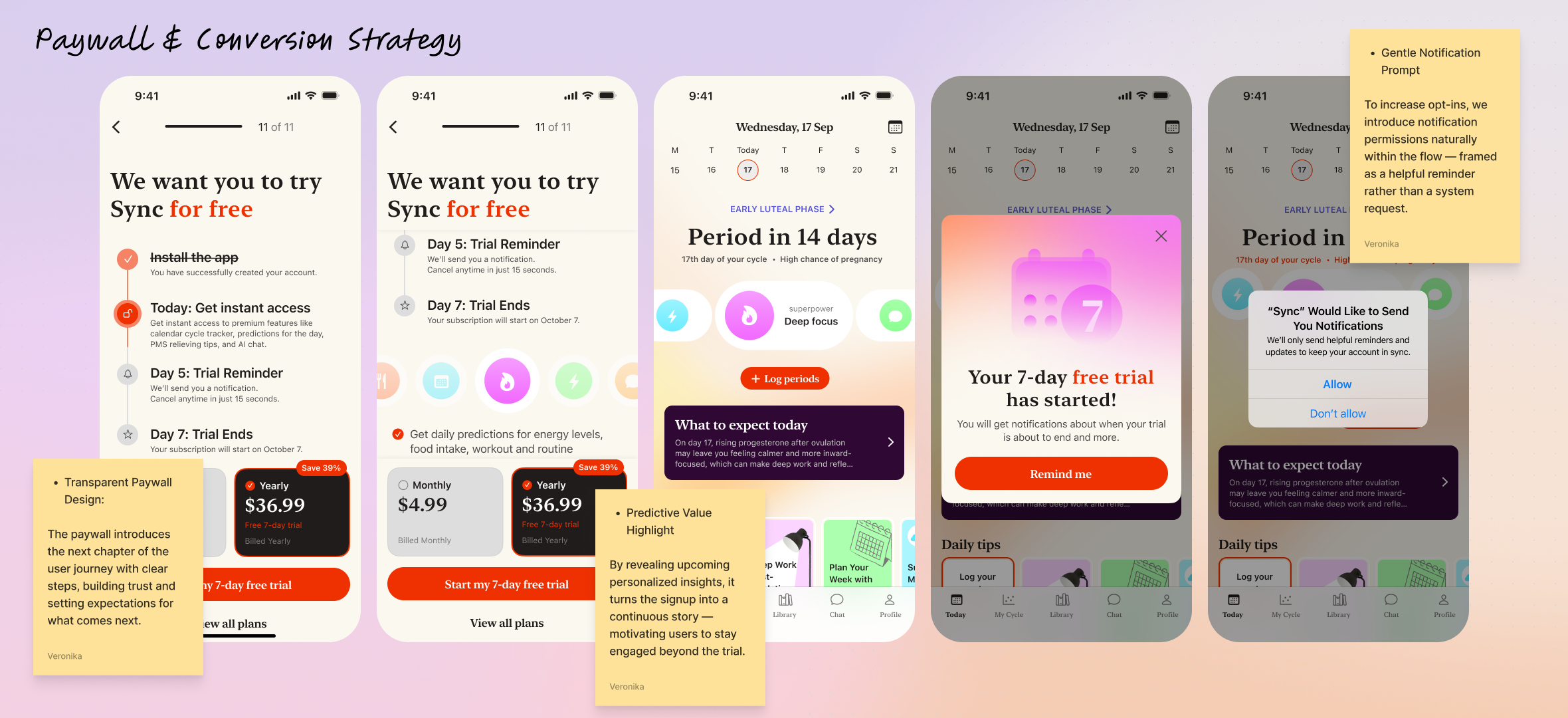
Depth Grows Over Time

While the app is positioned around “period guidance,” users’ curiosity expands. They often explore hormonal balance, productivity, and mood links later. Surfacing deeper educational content contextually keeps the app relevant beyond tracking.
abstract painting

JTBD: Get the free trial & Notifications allowed
abstract painting

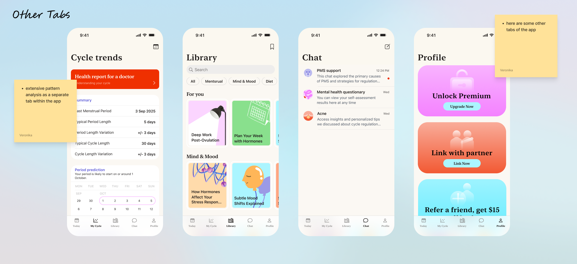
Development

In order to fasten the development speed, we’ve used native IOS components but added some unique colors to it.

Learnings & Conclusions

  1. I’ve learned that AI can’t really replace the defining phase of UX Research.

I tried using Genway AI tool that conducts the interviews instead of you, yet it lacked the empathy at this stage of AI development. I do see a use of it for some hypotheses check for web design, but for Mobile App with heavy informational architecture Ai can’t be used as a serious resource.

  1. Same goes for wireframes. I tried UX pilot for generating the wireframes with IOS components, but those weren’t usable at all.

The fact that every line on the figma frame has a frame and #div, frustrating indeed.

  1. Native components are so great for the MVP

It takes you further. That’s where AI is getting sidetracked. In 5 minutes of IOS library components work, I am having a proper screen, ready for dev.

  1. The problem chosen is due to my experience with cycle syncing and this case study is being finished by now when I’m strongly hit by progesteron, therefore, very focused.

I wish to see this app coming to life. Please, connect ❤️

Thank you for staying!
Mobile App

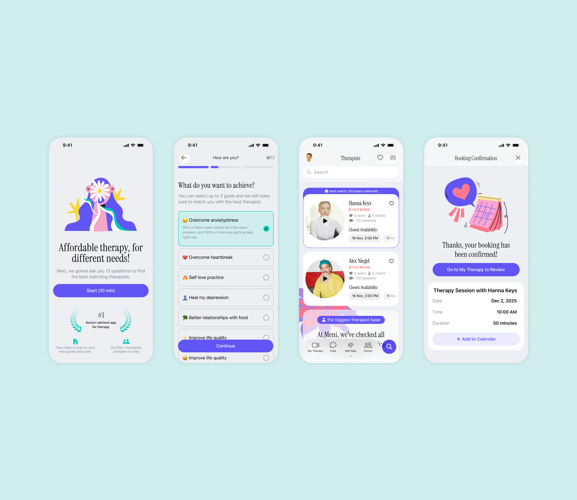
Therapy App for Therapists and Their Clients

Coming Soon

abstract painting

Mobile, Web / for Car Repair Shops & Car Owners

How a Clear Design System Cut 2 Weeks off Development Time: Car Repair CRM

Coming Soon
magazine spread

Mobile App / IOS Native Components

Designing Sync to deepen cycle awareness, boost retention and drive organic growth

Tools: Figma, FigJam, Miro, Zoom, UX Pilot, ChatGPT, Genway

My Role: Product Designer

Problem:

Women struggle to understand and manage fluctuating energy, mood, and productivity throughout their menstrual cycle, because most period apps only track dates instead of providing actionable, cycle-based guidance.

Solution:

Sync translates hormonal patterns into simple daily recommendations for energy, mood, and productivity — helping women live in alignment with their cycle rather than against it.

Results:

  • Increase of app's MAUs and retention rate through sticky feature implementation
  • CRO optimization across core apps functionality and Activation rate increase
  • 5/5 users successfully completed the key scenario during testing without any hints

Defining the Problem

Competitors Lack Credible Scientific Communication

  1. Onboarding flows across competitors are overly long and cognitively demanding.

Competitor’s research and User Interviews revealed that users often install these apps during the first day of their cycle — a high-fatigue, low-patience moment. This mismatch leads to high abandonment during onboarding.That’s why we made the onboarding shorter.

  1. Top competitors position themselves as doctor-recommended for credibility, but rarely communicate scientific depth.

We identified an opportunity to strengthen trust by integrating hormone-based data and evidence-backed insights, creating a bridge between medical credibility and everyday usability.

  1. Competitors personalize notifications effectively but lack true retention drivers.

Through push strategy analysis, we found that apps like Flo excel in cohort-based personalization yet fail to build long-term stickiness.Since retention and value reinforcement were key goals for Sync, we introduced sticky features grounded in user praise and positive reinforcement to celebrate progress and strengthen emotional connection.

abstract painting

A personalized sticky feature that drives retention through daily predictions and positive reinforcement.

Fatigue and Mood Dips Are the Toughest Pain Points:

Key insights from five user interviews conducted via Zoom and analyzed in Maze. The findings were manually categorized into themes such as pain points, motivations, and behaviors, highlighting early feature ideas and opportunities for improvement in the cycle tracking experience.

  1. Daily prediction cards or reminders focused on energy + nutrition, to align lifestyle choices with energy levels, improving productivity and well-being.

Users want a simple, visual way to understand their energy levels and plan workouts, meals, and rest around their cycle. They seek personalized, supportive tips and accurate predictions that feel relevant to their daily life — empowering them without feeling medical or complicated.

  1. Helping women see their patterns, not just their periods

Users feel current apps lack personalized guidance and fail to adjust to their unique needs or patterns. They struggle to see clear progress or direction — which is why we added a Report section in a separate tab, where women can clearly see symptom patterns and log new symptoms to receive more personalized guidance over time.

  1. Fatigue and mood dips before menstruation are the most common pain points, with women seeking clearer guidance on how to adapt.

That’s why we introduced AI-powered daily pro tips, personalized by cycle phase and symptoms, to help women manage their hormonal health and feel connected to their bodies. We also added a fun Story-sharing feature to boost engagement and drive organic growth.

abstract painting

Here are some of the core user interviews insights.

“I feel like women have very, very different, uh, types of how they can be on their cycles. So I think a heavy personalization that could be done with AI would be the best approach.”

abstract painting

Onboarding Flow: Few simple questions to keep the process calm and quick, especially for women discovering the app during menstruation. A progress bar shows where they are in the flow.

CJM & User flow:

This persona highlights users’ need for personalized, easy-to-use cycle tracking with smart reminders, nutrition tips, and mood insights — helping them plan their days and feel more in control of their energy.

Insights from CJM:

  1. Build Trust Through Transparency

Users are cautious about data sharing and AI use. Clearly explain why data is collected, show trust signals, and reassure them that their information is secure and never sold.

  1. Make Onboarding Effortless and Empathetic

Ask only essential questions, include a progress bar, and allow skipping additional steps. A calm, quick onboarding creates comfort — especially during menstruation.

  1. Communicate Science With Empathy

Educate users about hormones and mood in simple, relatable language. Focus on self-care and empowerment to make the experience supportive and uplifting.

  1. Encourage Engagement and Organic Growth

Add shareable templates and a referral option to help users celebrate progress and spread awareness. Beautiful visuals and clear App Store materials drive organic reach and trust.

abstract painting

This image shows the app’s calm onboarding and home flow with daily insights, energy summaries, and shareable recommendations to boost engagement.

abstract painting

A bit of boring stuff: Sitemap & User Flows

MVP

Insight: Celebrate the “Light” Screen

When users reach a positive state or completion moment, amplify the experience with warmth and encouragement. The more supported and seen a person feels, the more likely they are to stay engaged and convert. A celebrated user is a retained user.

abstract painting

JTBD: Logging periods

abstract painting

JTBD: Check current cycle phase

Depth Grows Over Time

While the app is positioned around “period guidance,” users’ curiosity expands. They often explore hormonal balance, productivity, and mood links later. Surfacing deeper educational content contextually keeps the app relevant beyond tracking.

abstract painting

JTBD: Get the free trial & Notifications allowed

abstract painting

Development

In order to fasten the development speed, we’ve used native IOS components but added some unique colors to it.

Learnings & Conclusions

  1. I’ve learned that AI can’t really replace the defining phase of UX Research.

I tried using Genway AI tool that conducts the interviews instead of you, yet it lacked the empathy at this stage of AI development. I do see a use of it for some hypotheses check for web design, but for Mobile App with heavy informational architecture Ai can’t be used as a serious resource.

  1. Same goes for wireframes. I tried UX pilot for generating the wireframes with IOS components, but those weren’t usable at all.

The fact that every line on the figma frame has a frame and #div, frustrating indeed.

  1. Native components are so great for the MVP

It takes you further. That’s where AI is getting sidetracked. In 5 minutes of IOS library components work, I am having a proper screen, ready for dev.

  1. The problem chosen is due to my experience with cycle syncing and this case study is being finished by now when I’m strongly hit by progesteron, therefore, very focused.

I wish to see this app coming to life. Please, connect ❤️

Thank you for staying!

Mobile App

Therapy App: Retention, Activation and CRO impovements


Coming soon

abstract painting

Mobile, Web / for Car Repair Shops & Car Owners

How a Clear Design System Cut 2 Weeks off Development Time: Car Repair CRM

Coming soon

magazine spread