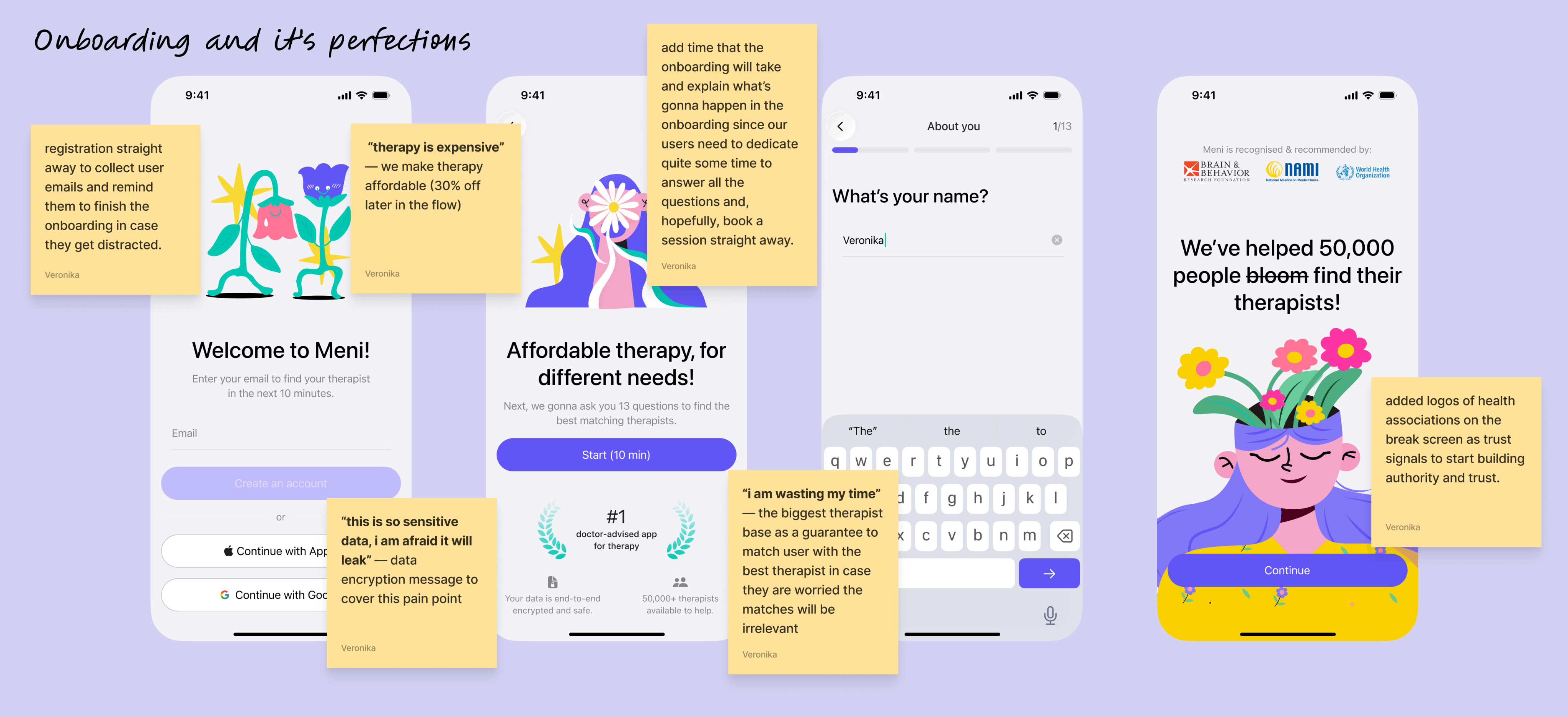
Defining the Problem
Competitors Lack Credible Scientific Communication
- Stigma, lack of confidence and concentration, “therapy is expensive”, felling wrong about feeling bad are the main pain points
Right after the competitor’s research I’ve held 5 user interviews to find out the common pain points user face with booking a therapy session in general, and using existing market offers in particular.
- Users feel exhausted and stuck after onboarding
4/5 users Users were delaying booking a session not because they lacked motivation, but because the onboarding flow was cognitively exhausting. By the time they received their therapist matches, many experienced choice paralysis and postponed taking action, despite already recognizing the need for therapy.
- Rigid Pricing & Package Friction
The requirement to purchase session packages caused some users to leave the platform and seek therapists elsewhere, especially when they only needed one session. This showed a mismatch between business goals and user expectations.
Fatigue and Mood Dips Are the Toughest Pain Points
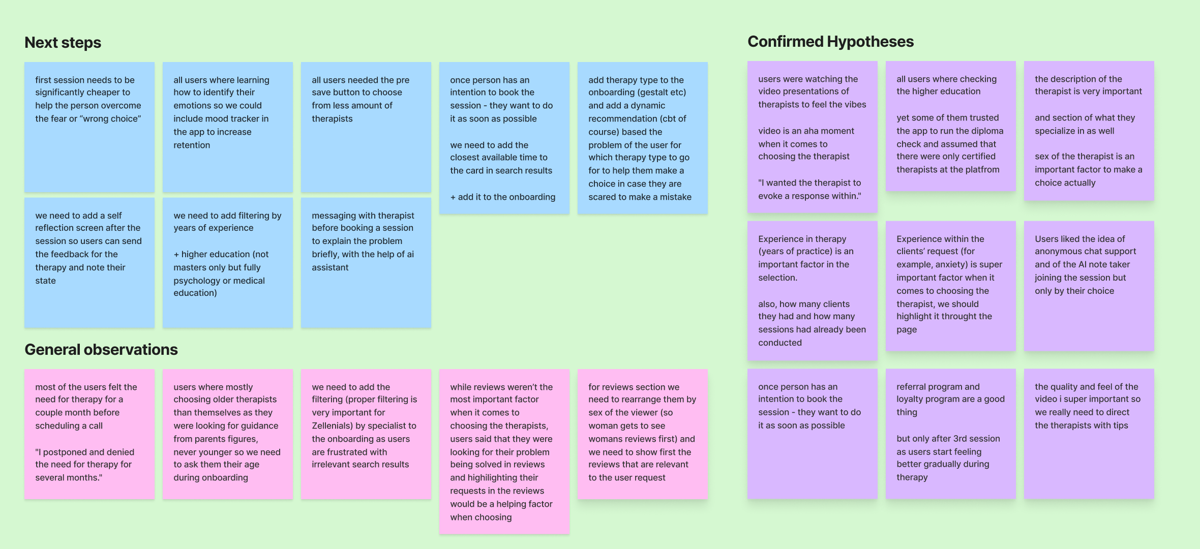
I think I still want to remind that the users we are dealing with are very sensitive and in a dark kinda place. When conducting user interviews I talked a lot about their experience and emotional state along the booking journey. On the image below you can see Figjam stickers that I’ve categorized, based on the insights received:
“I just needed someone to tell me that I was okay. That I wasn't losing my mind. That everything was fine, that this happens. And that there are specialists that can help you”
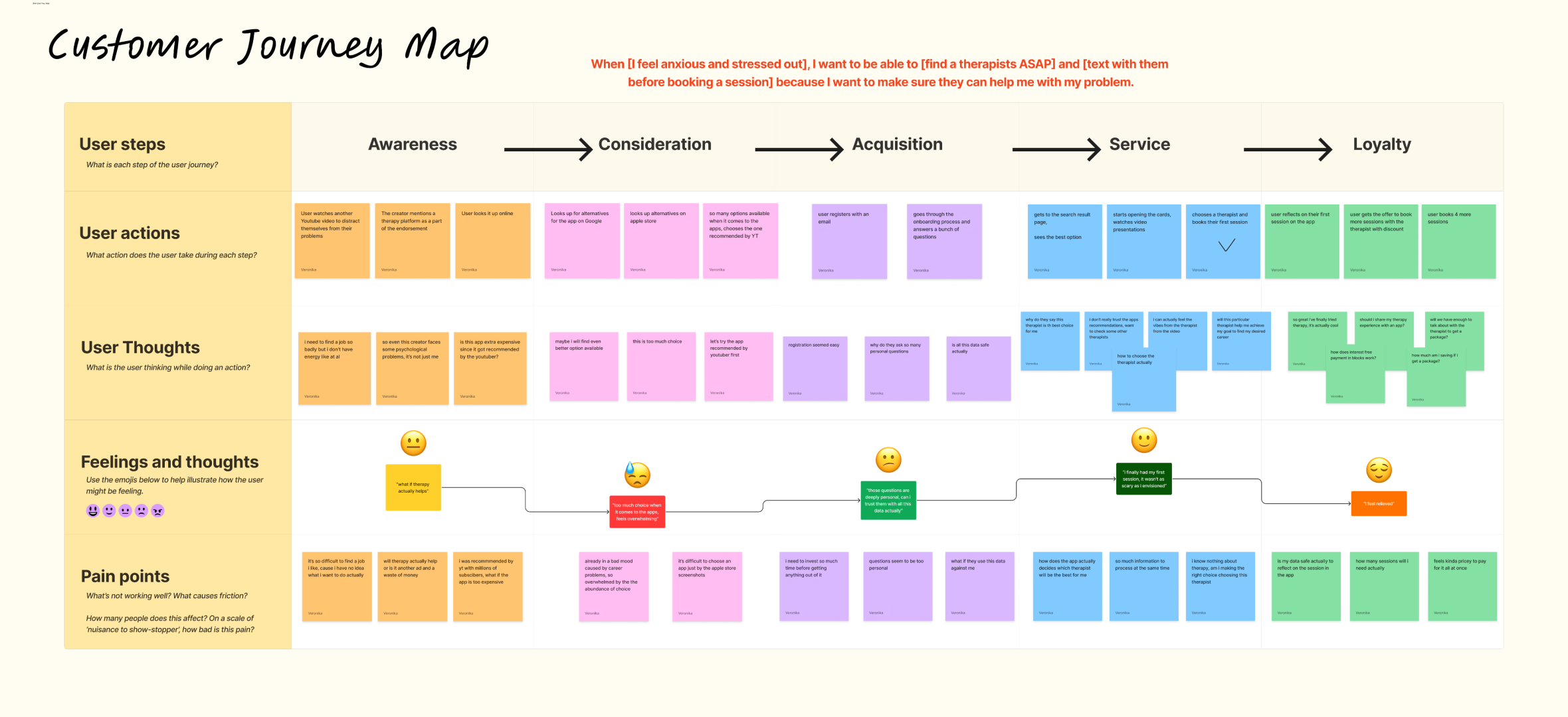
User persona & CJM:
- Emotional Safety as the Core Value
Julia is primarily seeking emotional safety, validation, and reassurance rather than just functional therapy features. She wants to feel understood, supported, and confident that she’s not “broken.” The product should therefore feel like a calm, guiding companion, not a cold marketplace.
- Curated Guidance Over Endless Choice
Too many options overwhelm Julia and slow her decision-making. She doesn’t want endless browsing — she wants a small, well-curated set of relevant matches she can trust. Reducing cognitive load is key to helping her move forward.
3. Trust Is Built Through Human Signals
Julia judges therapists largely through human and emotional cues, not credentials alone. Video presence, authority, and relatability strongly influence her sense of trust. The experience should highlight therapist vibe and communication style early and clearly.
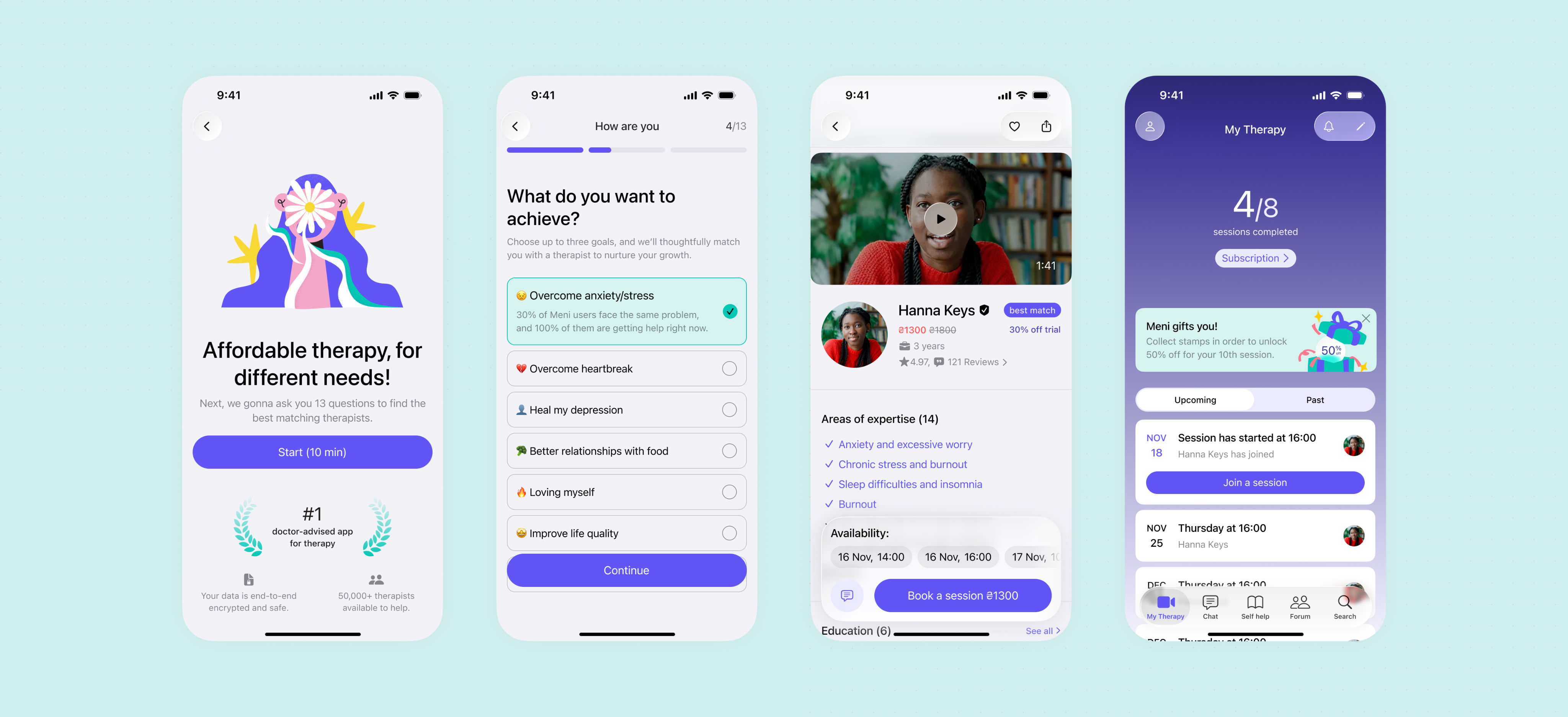
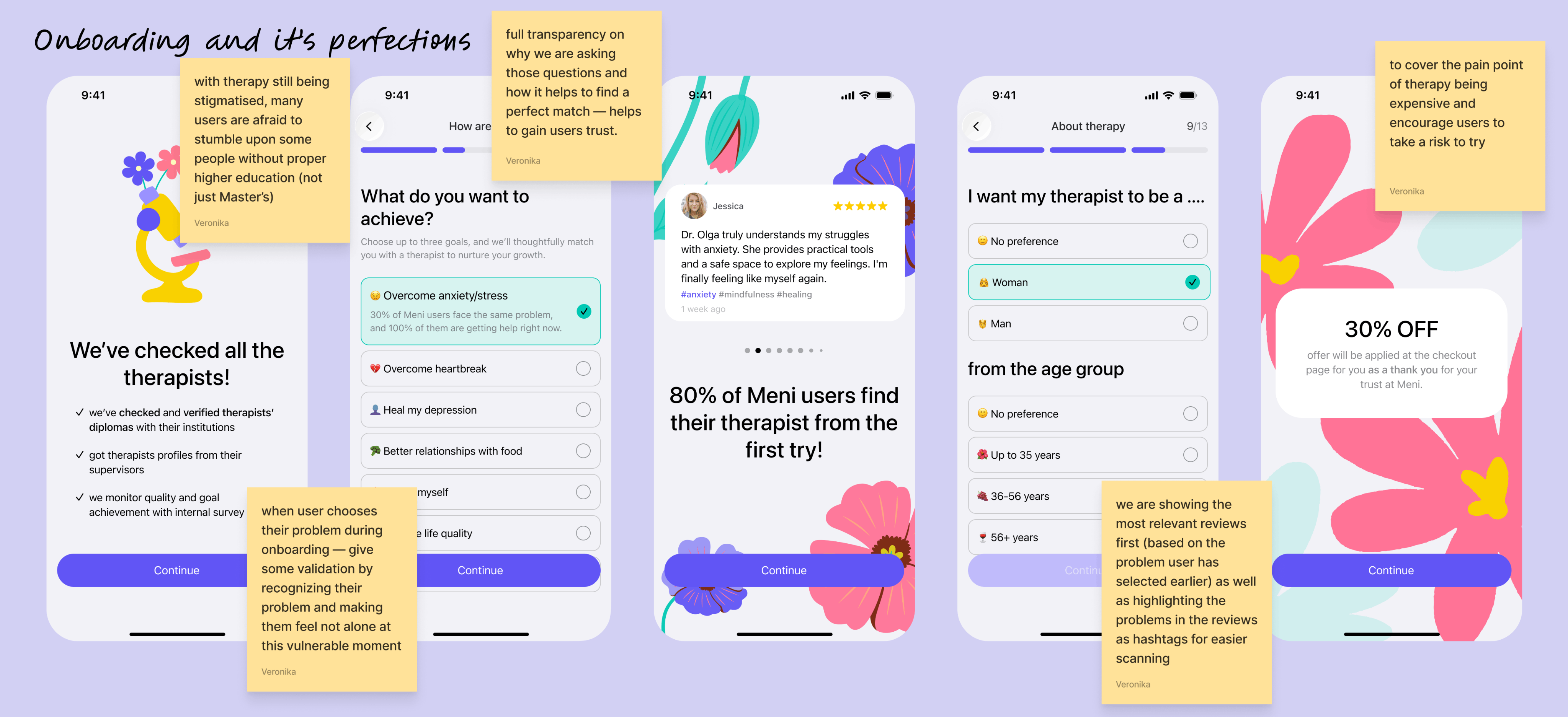
MVP
Validation and gentle pain points covery
Below you can see the core screens and Booking flow with lots of insights implemented from the UX research on the actual frames.
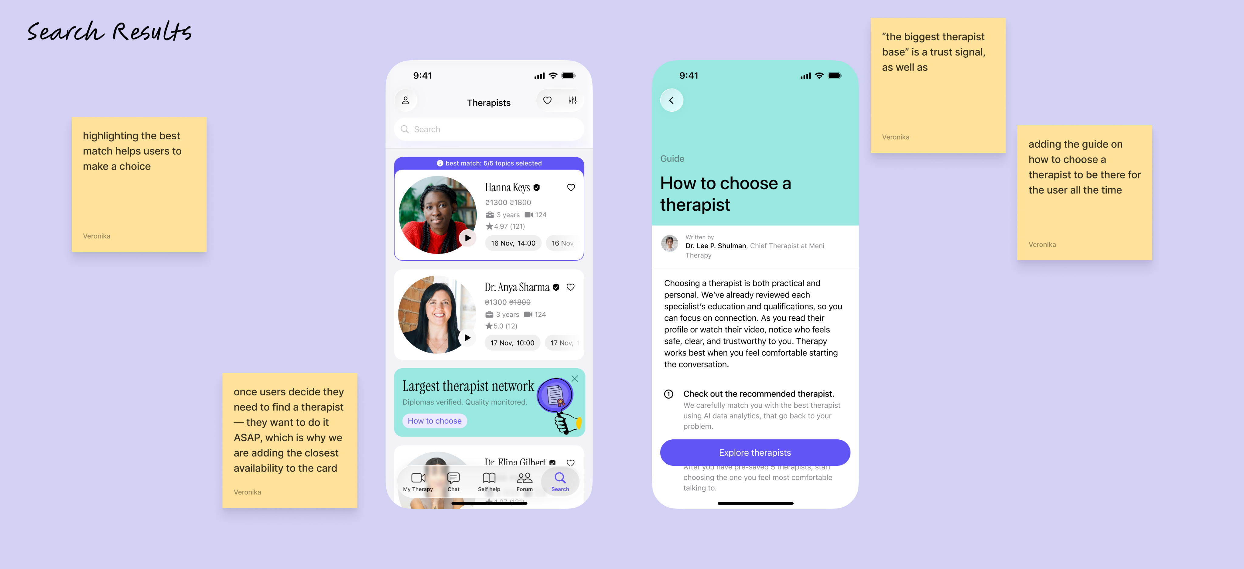
Search Screen with insights translated into frames
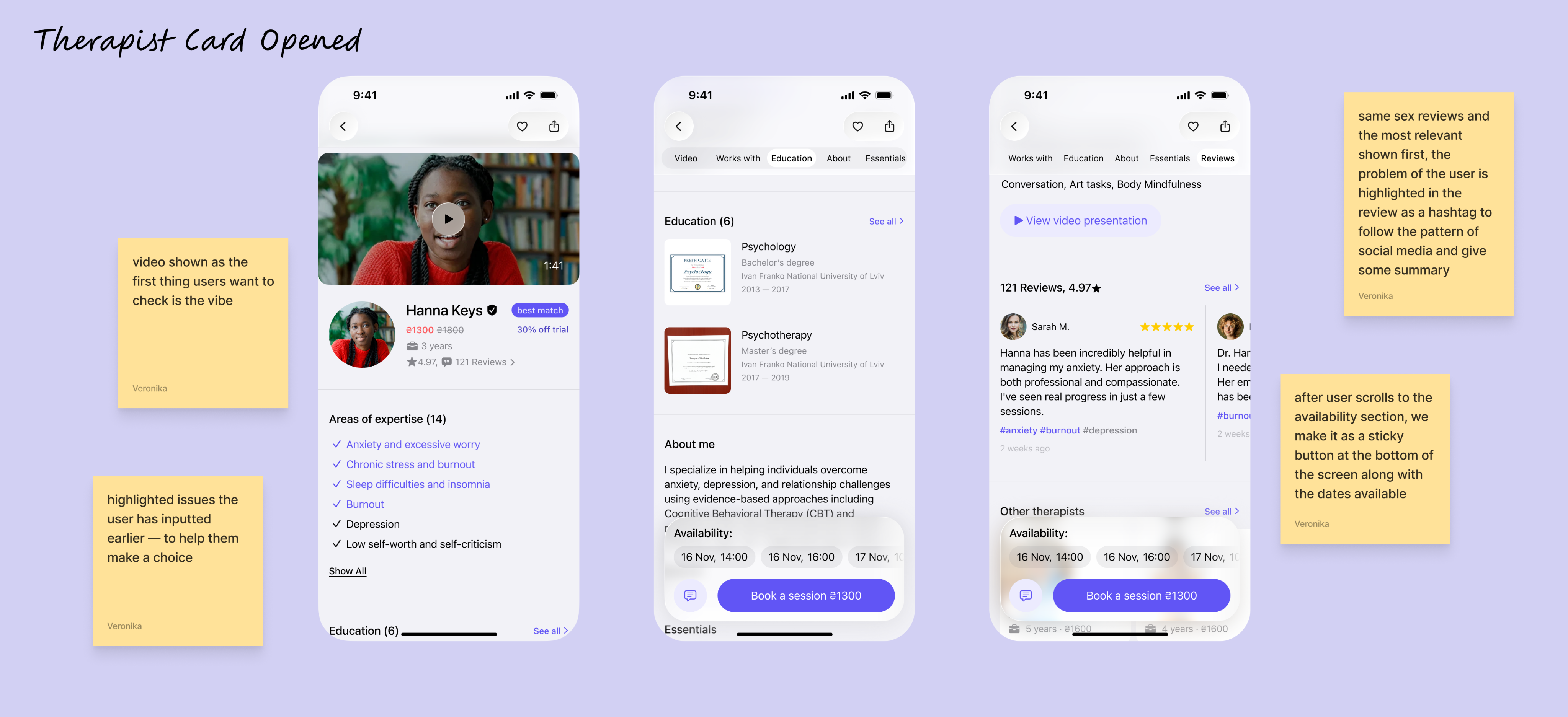
Therapist card made with lots of white space, button hierarchy in place and supportive, “growing” branding coming through app’s copy and visual language
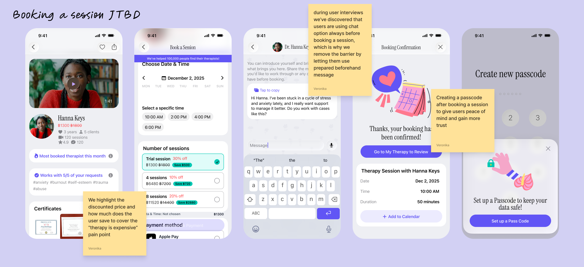
JTBD: When [I feel anxious and stressed out], I want to be able to [find a therapists ASAP] and [text with them before booking a session] because I want to make sure they can help me with my problem.
North Star of Meni
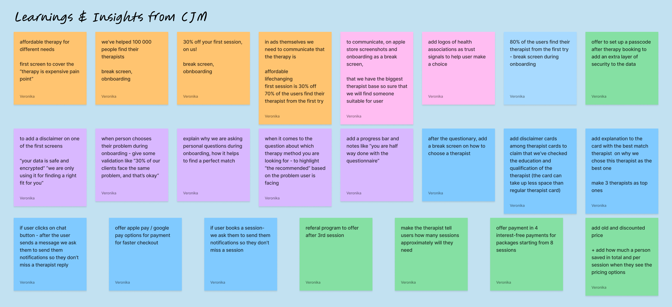
When working on the user persona and CJMs I was focusing a lot on North Star metric of Meni: successful onboarding, booking a session and finishing the first therapy session. Therefore, below you will see more of other flows related to optimization for conversion.
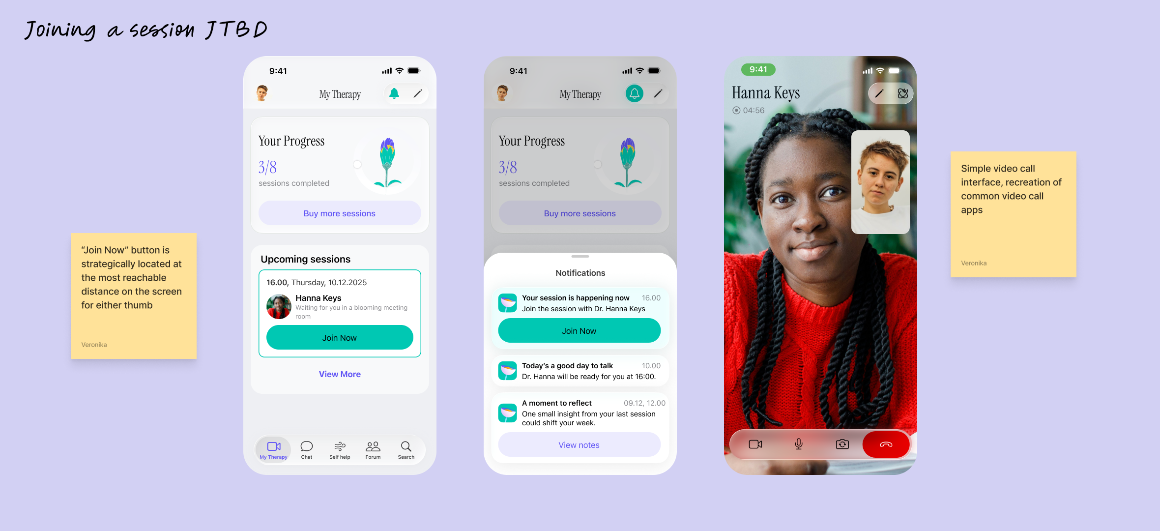
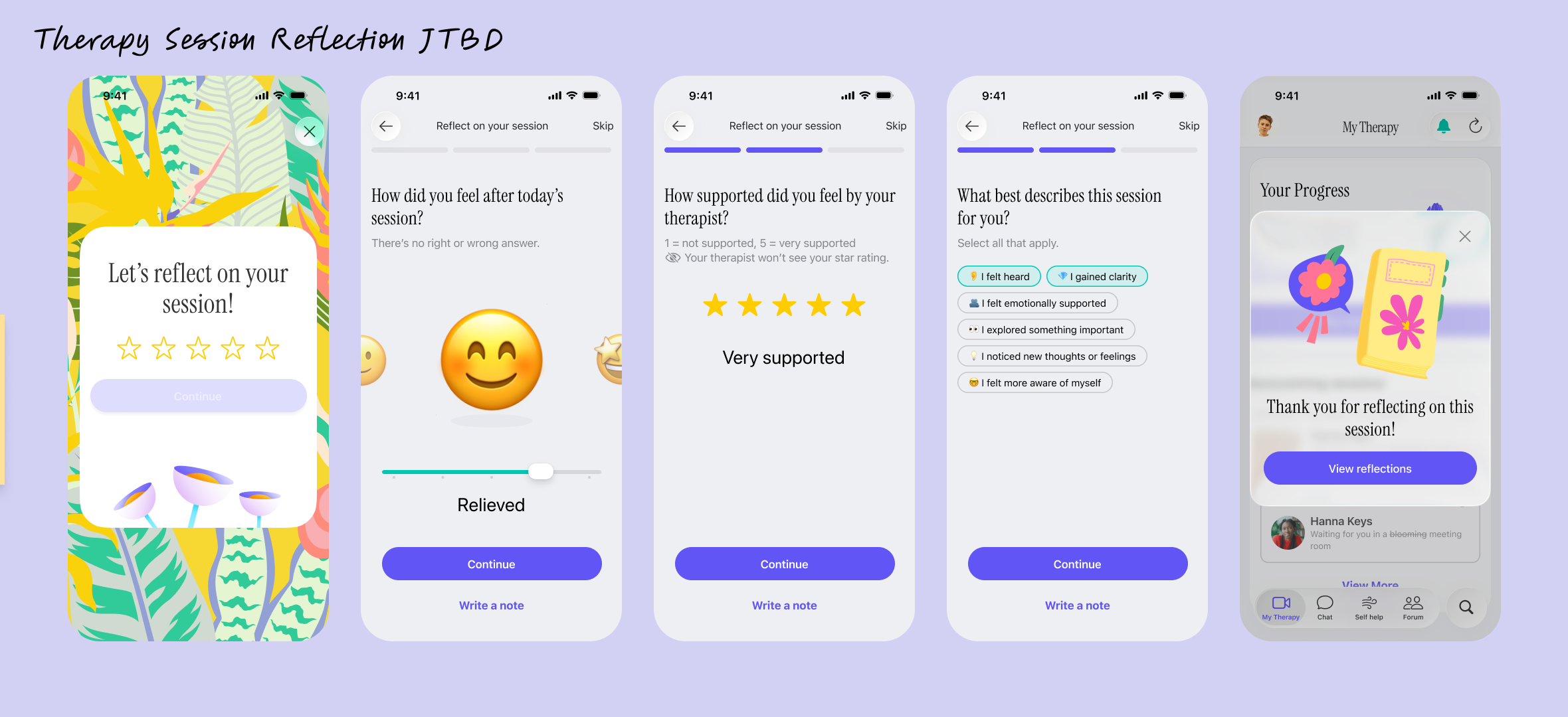
JTBD: Easily [join the session] and [get the much needed support].
Development
In order to fasten the development speed, we’ve used native IOS components and color pallete.
Increasing Retention, LTV
Referral Program to maximise the user acquisition cost
We all want something legit and tested by our friends when it comes to trying new things. Therefore, Referral Program is a great thing to introduce for Meni after 3rd session to maximise the LTV and user acquisition costs,
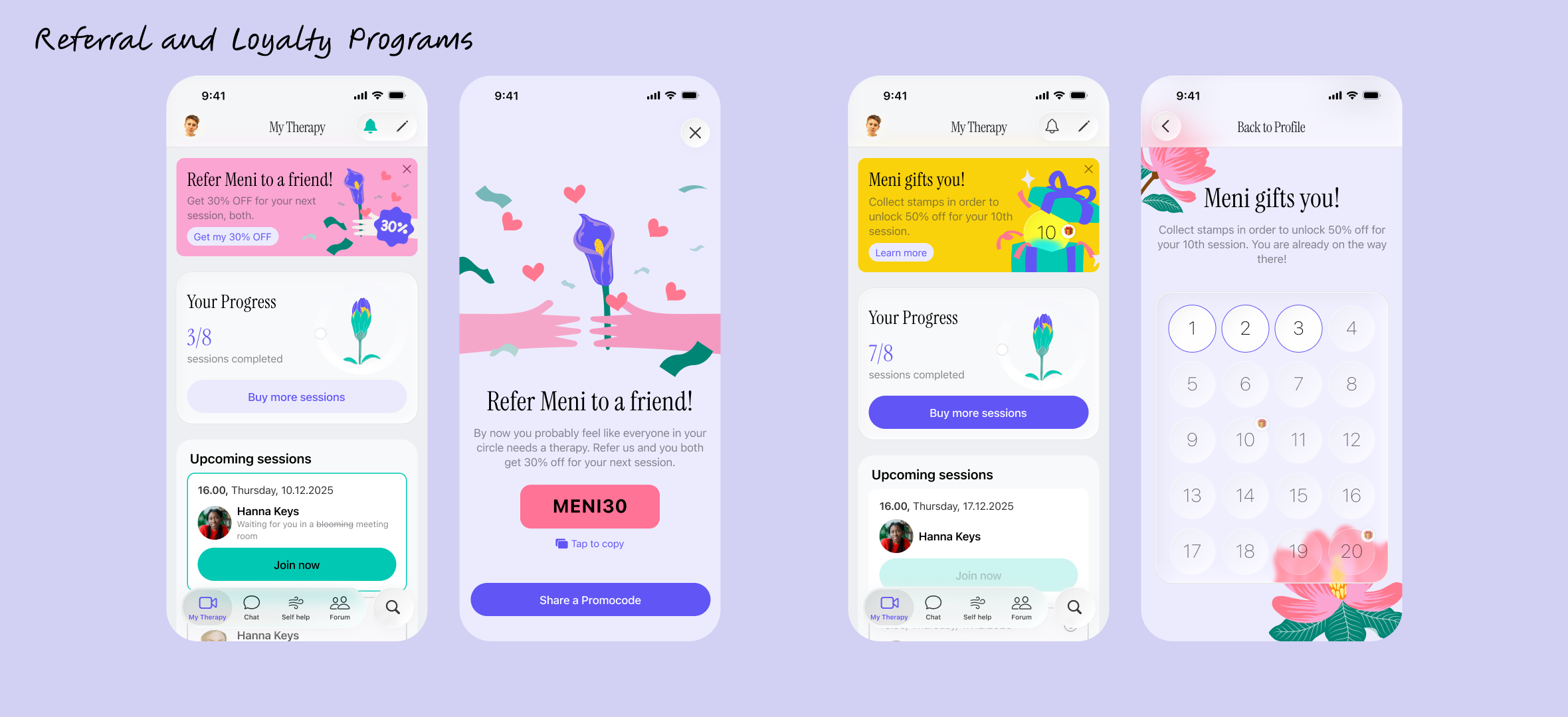
Loyalty Program as the main fuel for organic LTV growth
Note that the color of the CTA button for Buying more sessions is brighter when it comes closer to the end lof the user’s package.
Thank you for staying!
User Testing Insights Coming Soon!
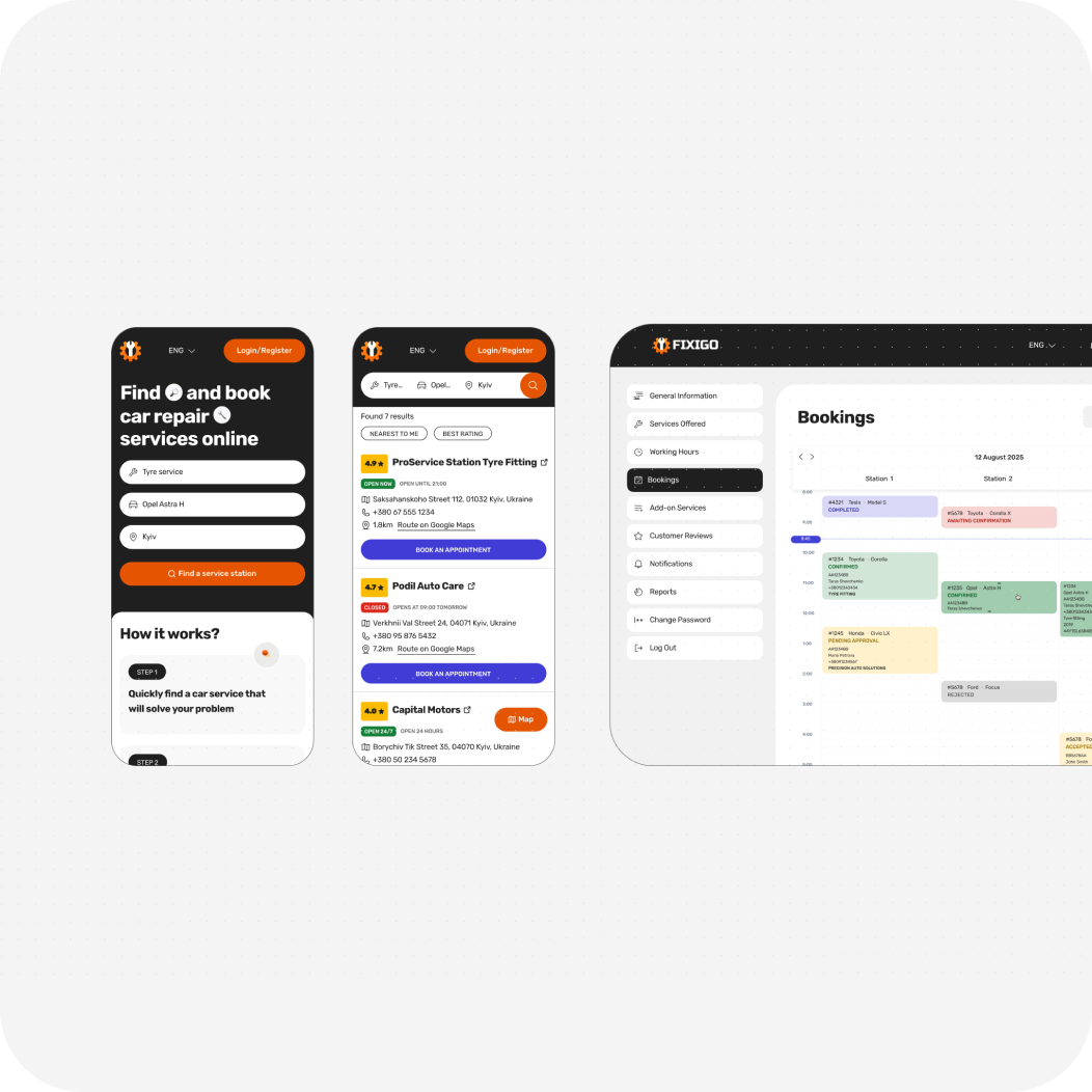
Mobile, Web / for Car Repair Shops & Car Owners
How a Clear Design System Cut 2 Weeks off Development Time: Car Repair CRM
Coming Soon